Illustrations & visual identity for landscape architecture studio "Kaitakai"
CLIENTs Vilma & Milda, Kaitakai founders
MY ROLE Identity CO-Design, bespoke illustrations and project managment
WEB DESIGN Ieva Mačiūnė (Kišūnaitė)
PHOTO Ilmė Vyšniauskaitė, www.pexels.com
LOGO ANIMATION Peter Kang
published 2024/2025
Right from the start, meeting Milda and Vilma showed us we were in for a challenging but exciting project. Gintare and I were especially happy that the clients firmly rejected the usual garden clichés, like green garden photos and leaf icons.
We needed to combine minimalism, structure, modern style vs creative mess, human warmth, and natural imperfection. The result is an interactive, meaning-packed, and distinctive identity that, even after a year, still brings the clients joy and truly reflects their creative work.
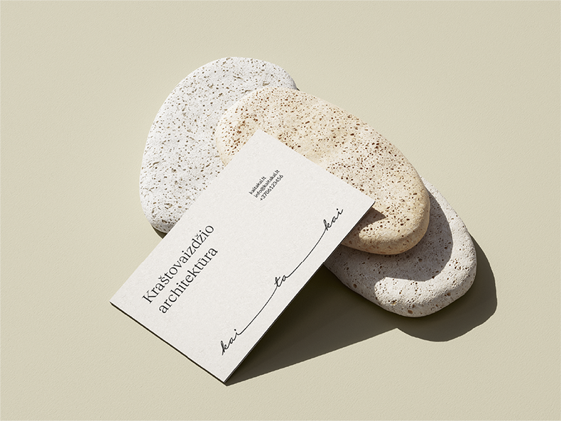
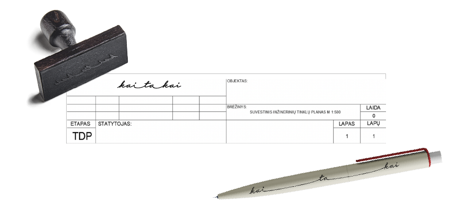
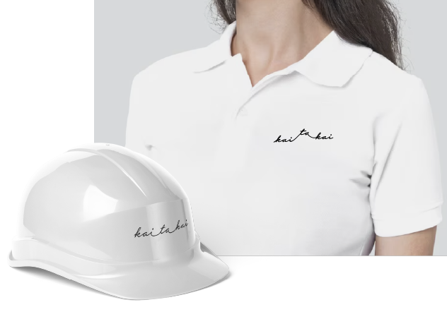
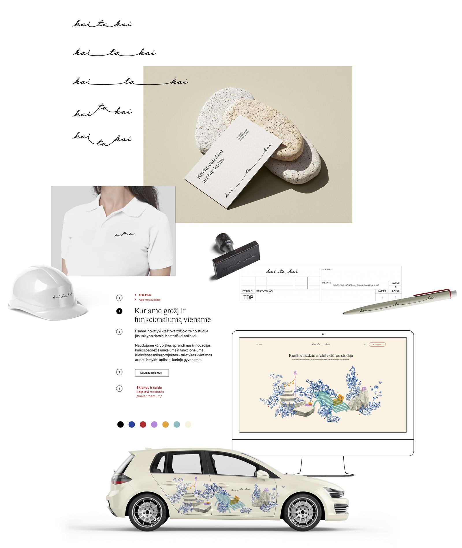
The logo works as both a hand-drawn signature and a winding path. Its connecting line can change, playing with the meanings in the name — 'kaita' means change and 'takai' means paths — to show natural cycles and shifts in landscape elevation.
Stylistic Exploration
Vilma and Milda make a great team. One is engineering-minded and prefers clear structures and forms, while the other is more instinctive, loves jazz, and focuses on big-picture connections. We wanted the identity to show both sides.
To understand their style, we learned they like layered collages that let each viewer find something new, lots of bright space with bold but balanced colours, a mix of structure and variety, and clean fonts. For the logo, they preferred movement, natural lines, and the idea of a path.
When we talked about their landscape work, we saw how important stone is. Every project includes it, whether as a natural, mossy decoration or a carefully cut stone tile in a path.
According to the clients, "as many wild nature elements as possible should remain in the human environment," and stone is one of them.
If you are interested in the process we followed with the clients, you can download and review the stylistic directions and design proposals here (all rights reserved).
Concept & Process
We built a new, lively visual system for Kaitakai from scratch, including the concept, research, and style guide, working closely with Gintarė.
As an illustrator, I created custom illustrations to show Kaitakai’s unique, poetic spirit.



Concept & Process
We built a new, lively visual system for Kaitakai from scratch, including the concept, research, and style guide, working closely with Gintarė.
As an illustrator, I created custom illustrations to show Kaitakai’s unique, poetic spirit.
Concept & Process
We built a new, lively visual system for Kaitakai from scratch, including the concept, research, and style guide, working closely with Gintarė.
As an illustrator, I created custom illustrations to show Kaitakai’s unique, poetic spirit.
The Illustration System
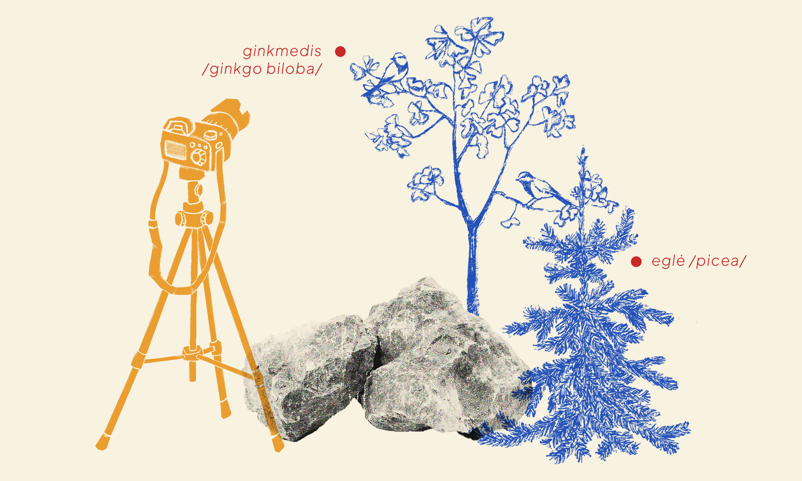
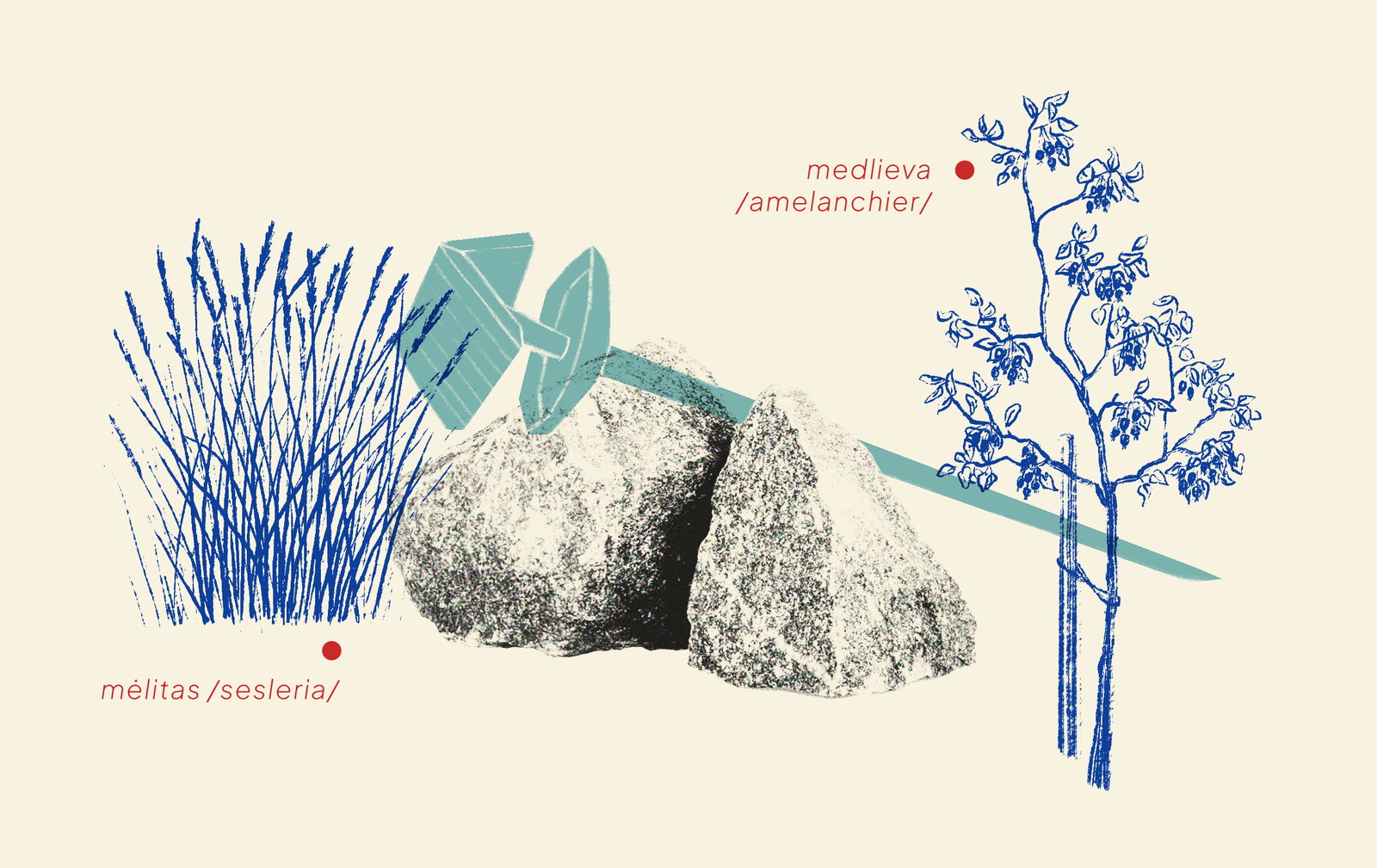
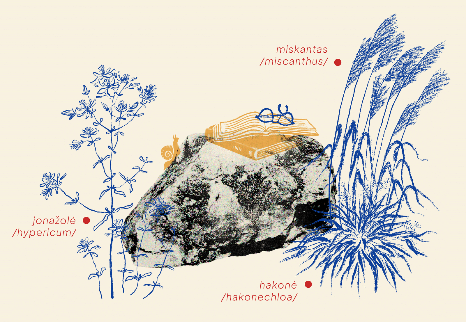
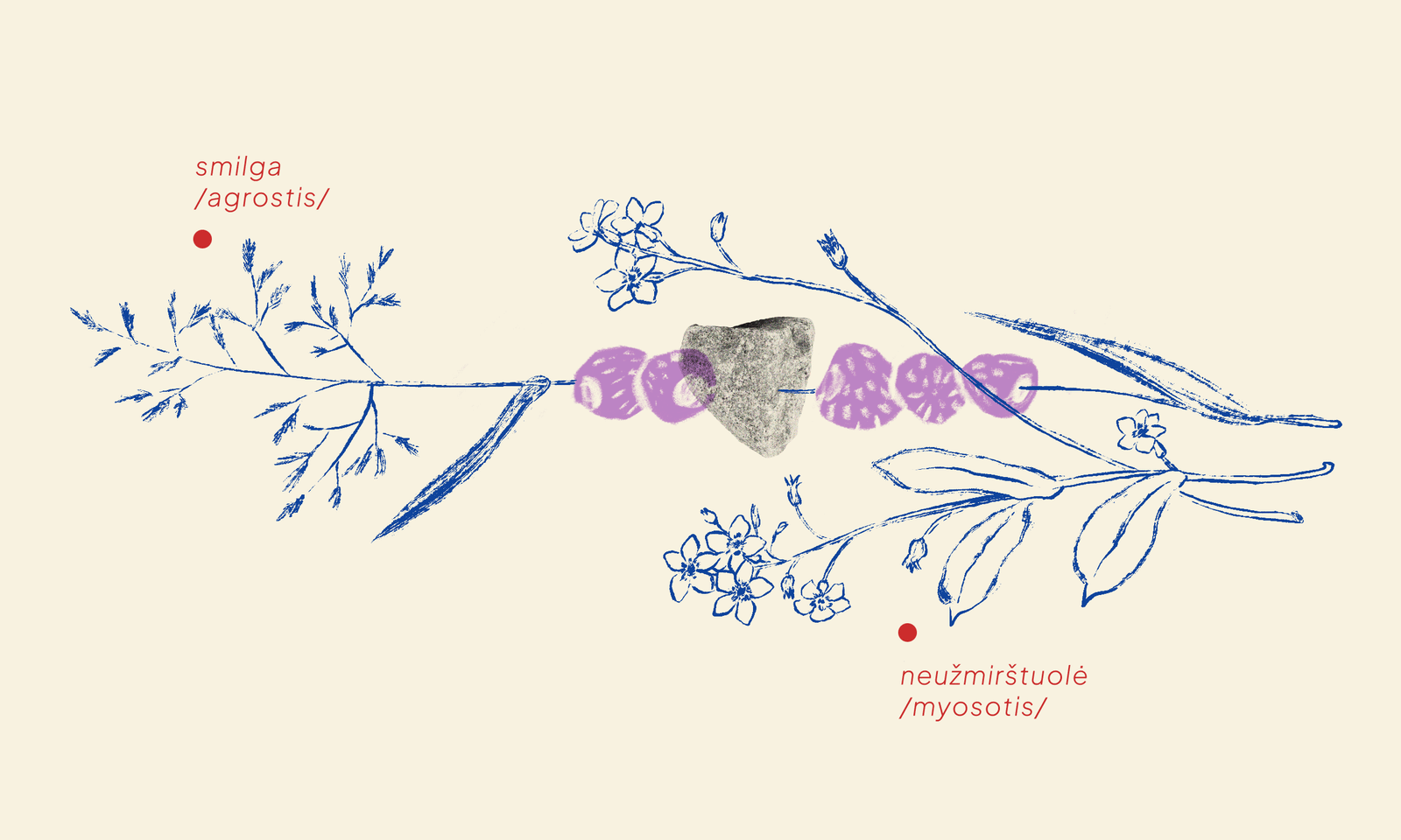
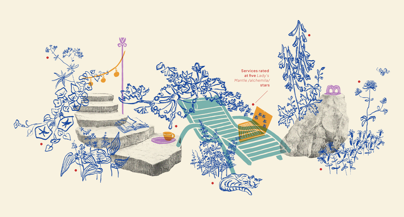
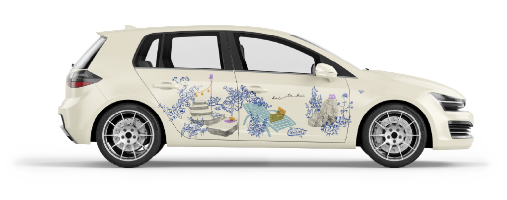
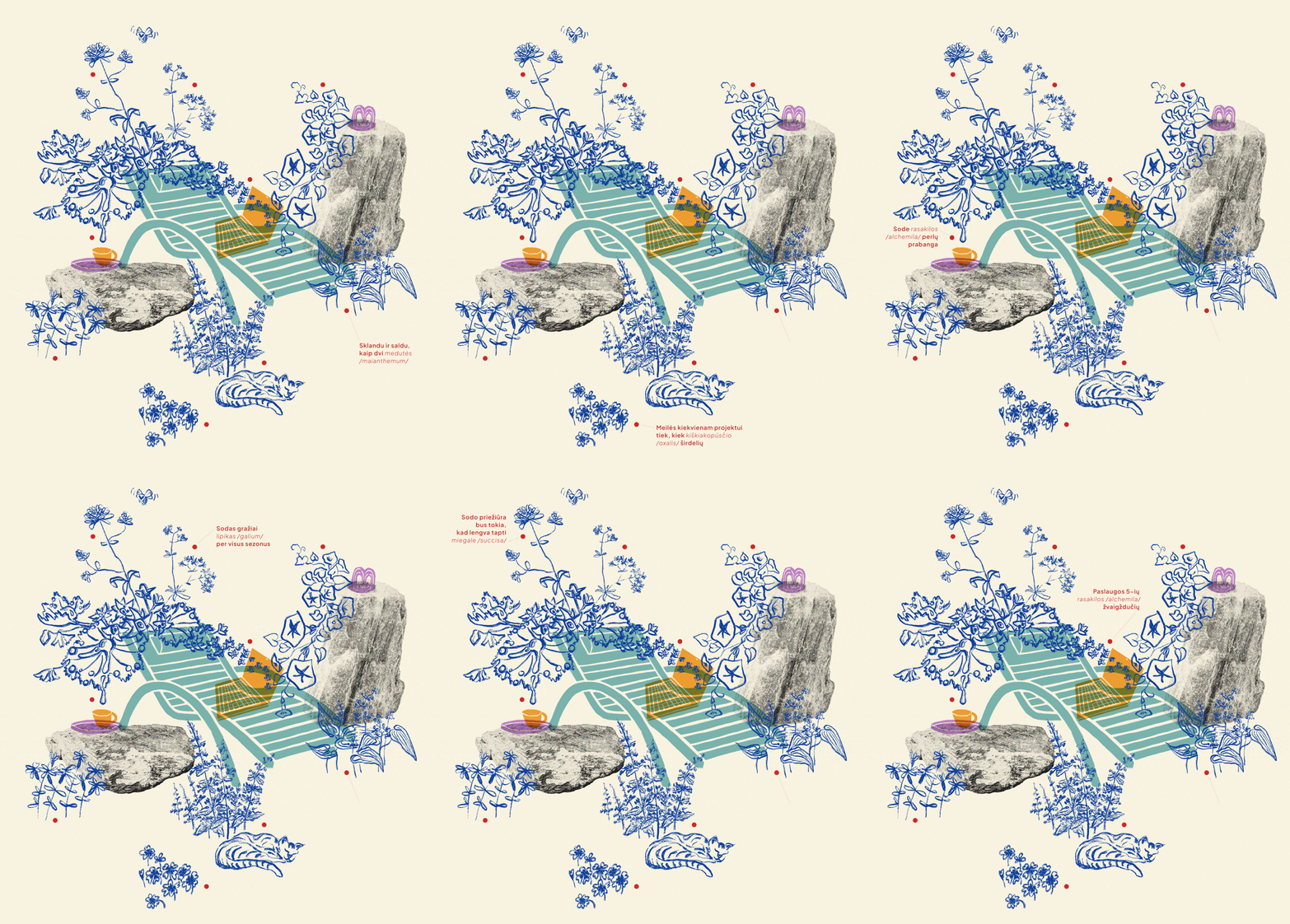
To show the idea of a 'tidy mess' in the illustrations, I created a flexible layer system:
Stone, a unifying symbol
Black-and-white photography with a grunge texture.
Some tool or object matching the theme
Stylised flat-form monochrome illustration with an overlapping effect.
Plants
Drawings rendered in a sketchy blue ink style.
AN interactive red dots with texts
Add them next to the plant pictures and include the plant names.
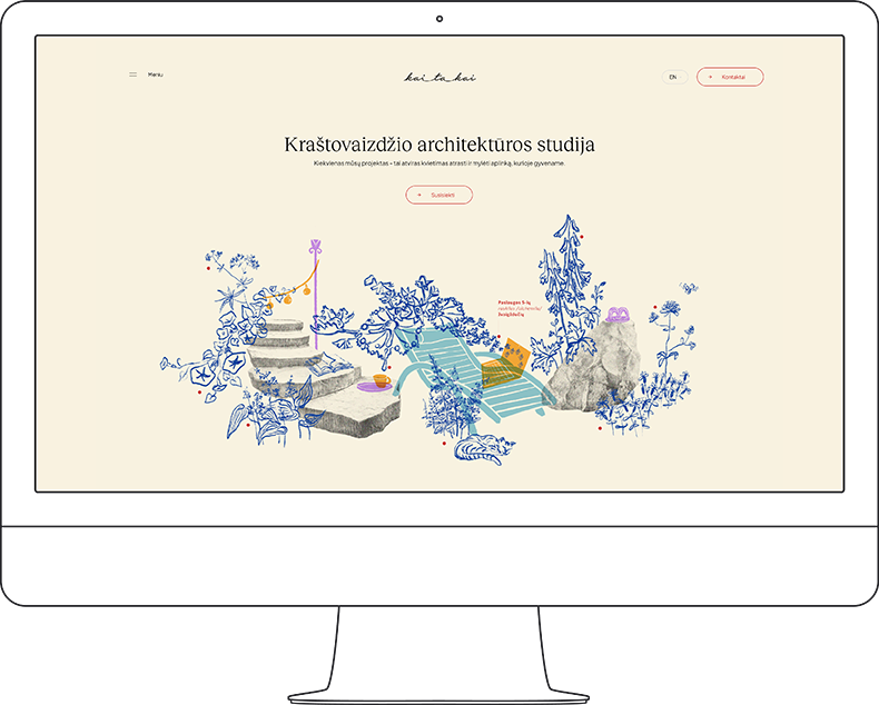
On the www.kaitakai.lt, the red dots look like sparkling suns, and the text beside them appears only when you hover over each dot.
A Wordplay in the texts
Kaitakai has two target audiences: people who know little about plants and seek professional help, and those deeply interested in the field.
For the second group, we decided that all plants in the illustrations should truly grow and thrive in our region and have Lithuanian names that playfully connect to the illustration's theme.
This idea is meant to spark an "aha!" moment when someone recognises the plant and notices the clever connection.
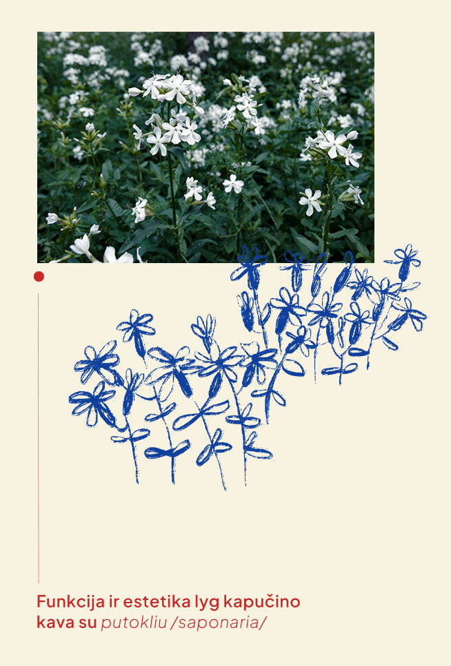
For instance, the Lithuanian name for Soapwort (Lat. Saponaria) is Putoklis—literally, something that foams—though it’s not related to soap. That’s why the caption next to Saponaria says:
“Function and aesthetics, like a cappuccino with a putoklis (froth).”
Another example is the text near Morning Glory (Lat. Ipomoea), which is called sukutis in Lithuanian, meaning something that spins all the time. So, the text next to Morning Glory reads as a promise:
“Your project sukutis (meaning spins) in our heads 24/7”
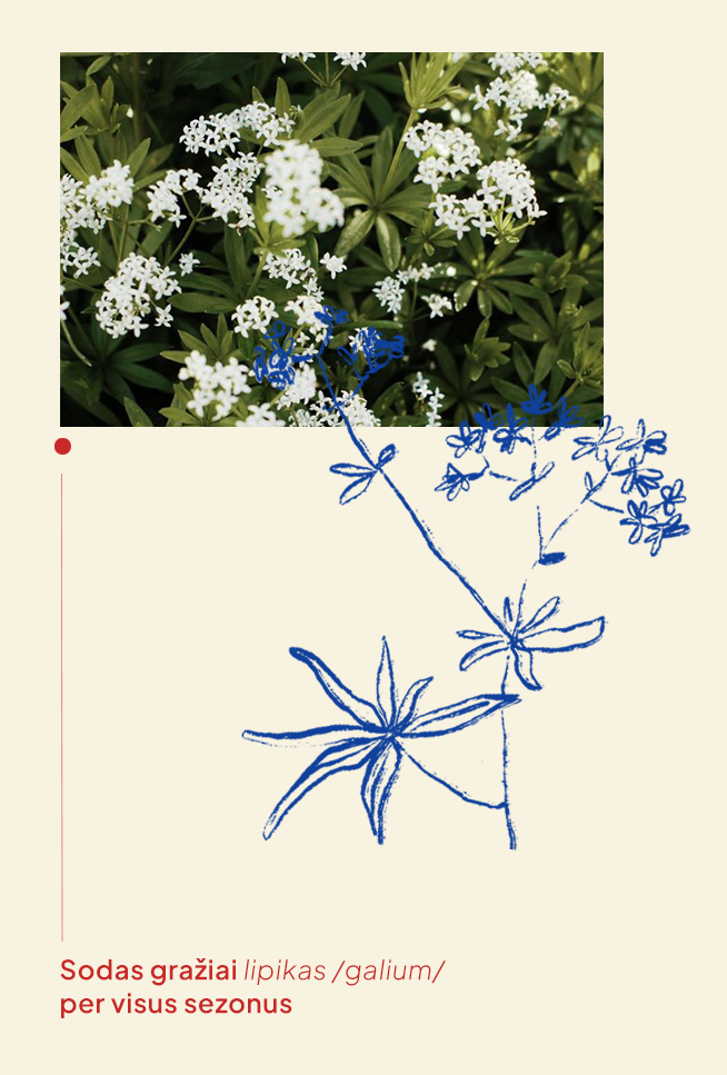
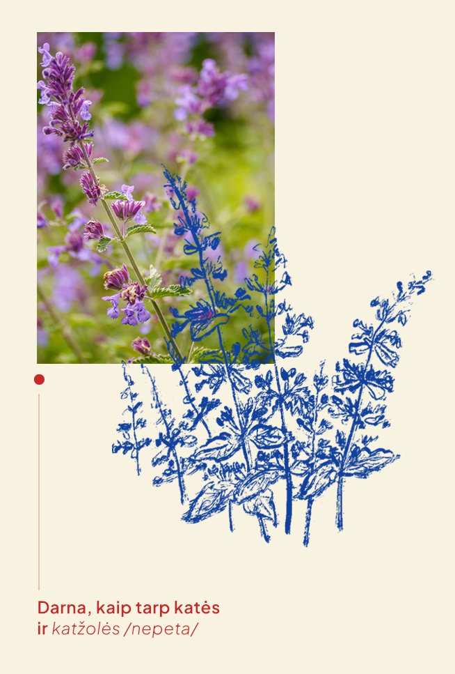
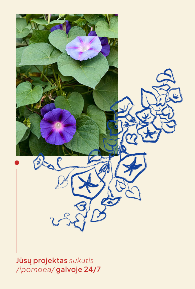
The plants chosen for each service are also intentional. For example, primrose (Lat. primula) is called raktažolė in Lithuanian (meaning "key-grass"), which is a fitting metaphor for consultations because it suggests unlocking knowledge.
On the Kaitakai website, this animation appears only when you hover over it.


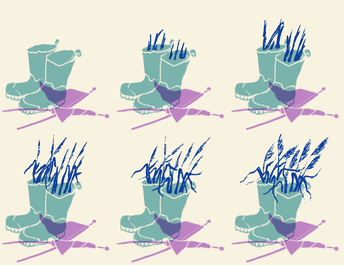



Next, various landscape design elements and their service areas needed to be illustrated using the same wordplay logic:
For the Ponds and Fountains section, I drew Burbulis (Globe flower, lat. Trollius) and Putoklis (Soapwort, lat. Saponaria), whose Lithuanian names mean bubbling and foaming.
For Lighting systems, I chose Naktižiedė (Campion, lat. Silene) and Miegalė (Devil's-bit Scabious, lat. Succisa), which in Lithuanian refer to a night blossom and a sleepy woman.
And so on :)
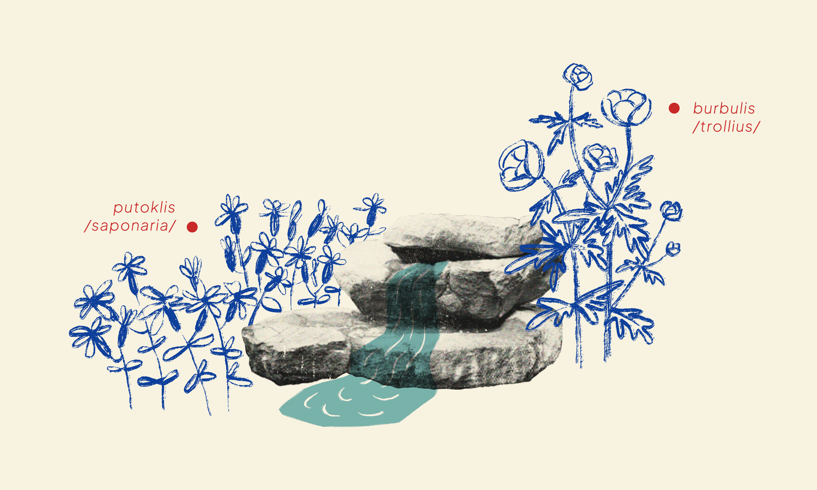
Theme: "Ponds, Pools, Fountains"
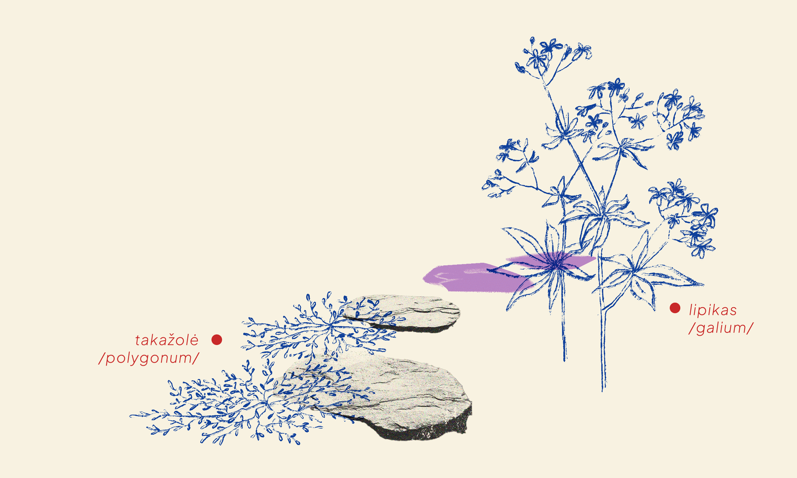
Theme: "Paths, Squares, Surfaces"
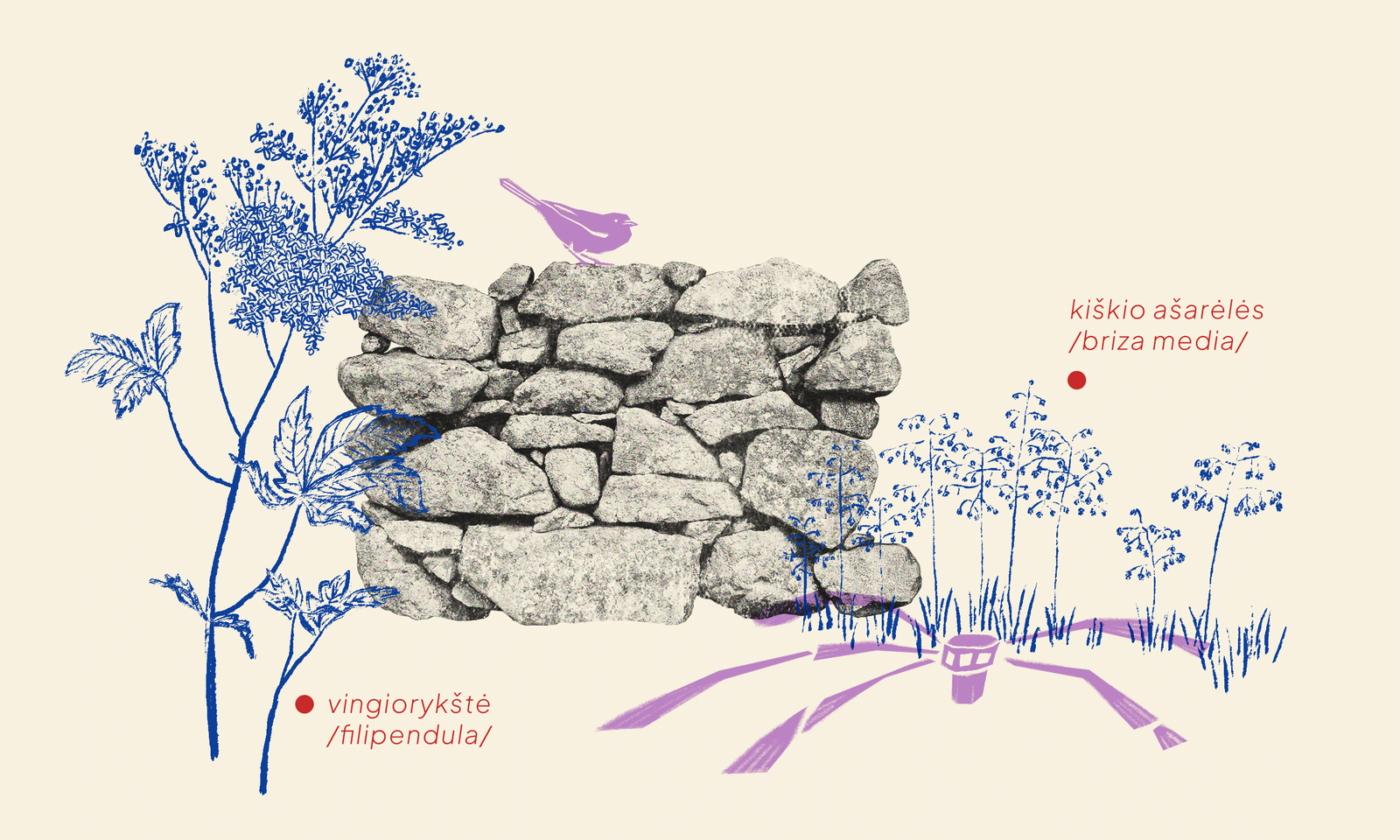
Theme: "Fences, Retaining Walls & Irrigation Systems"
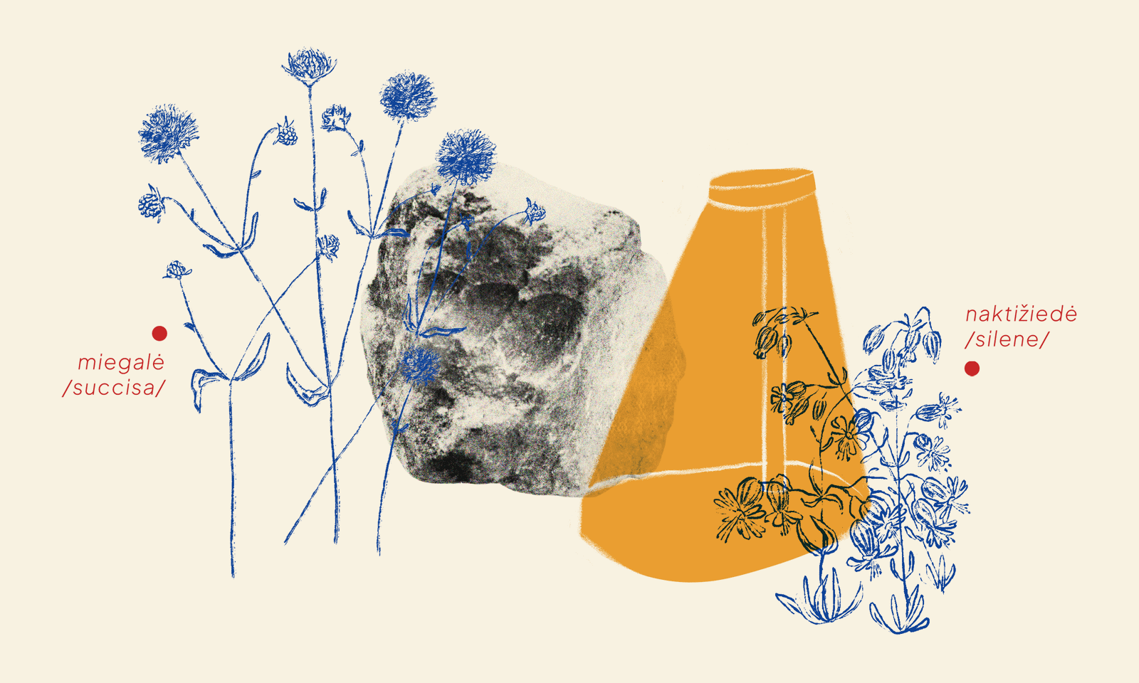
Theme: "Lighting Systems"
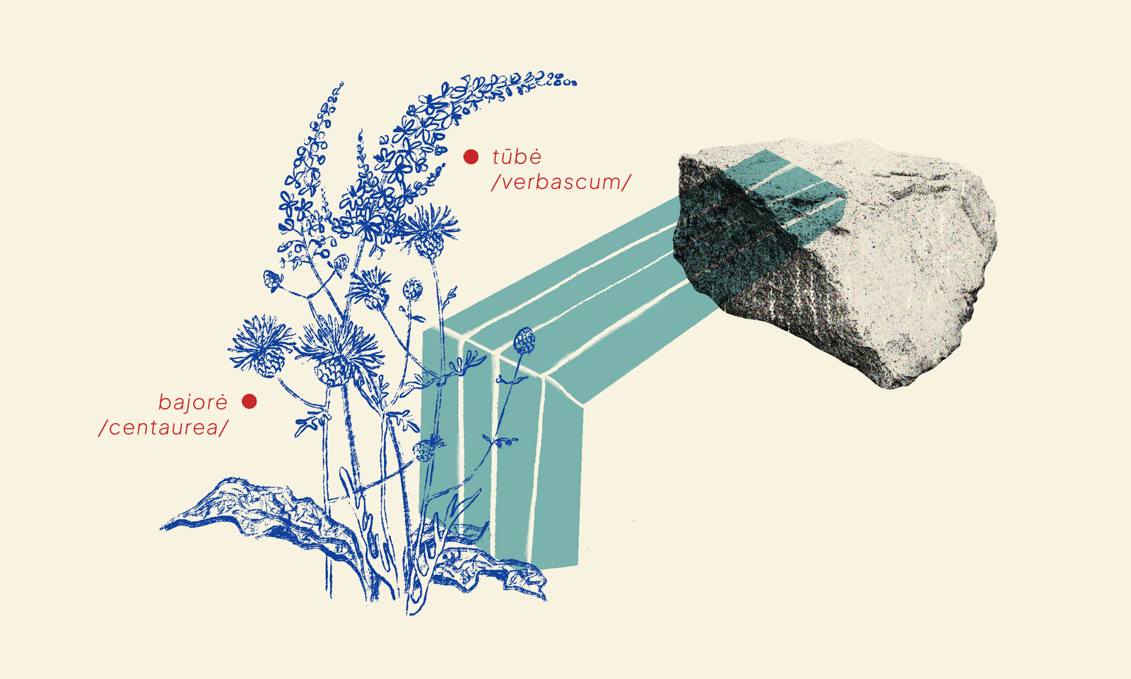
Theme: "Small-scale architecture"
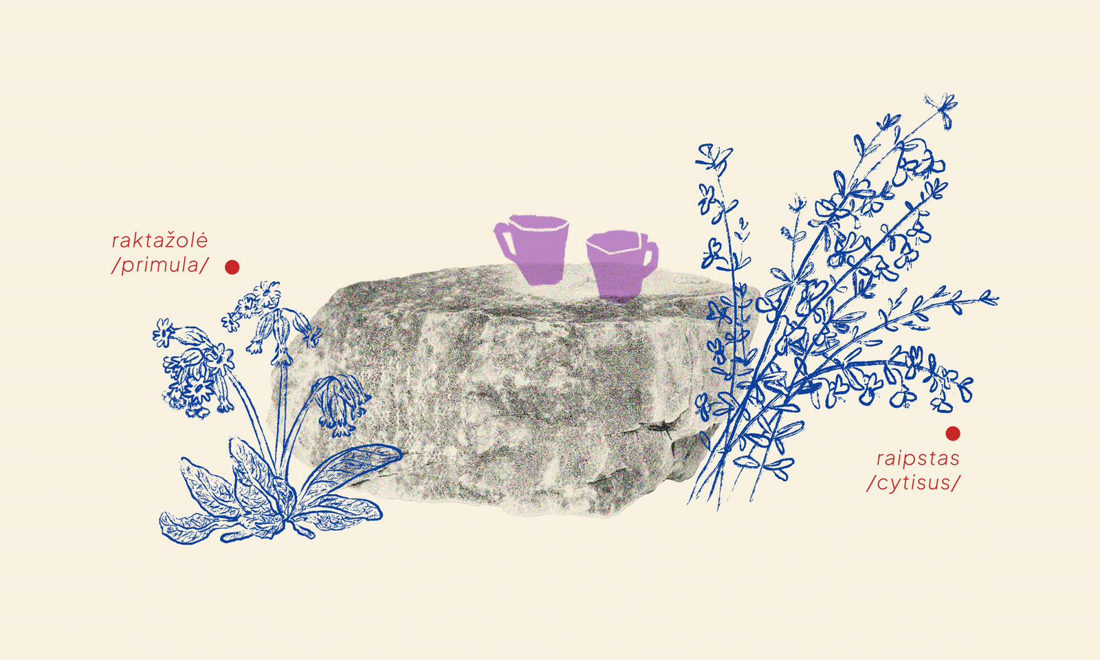
Theme: "Consultations"
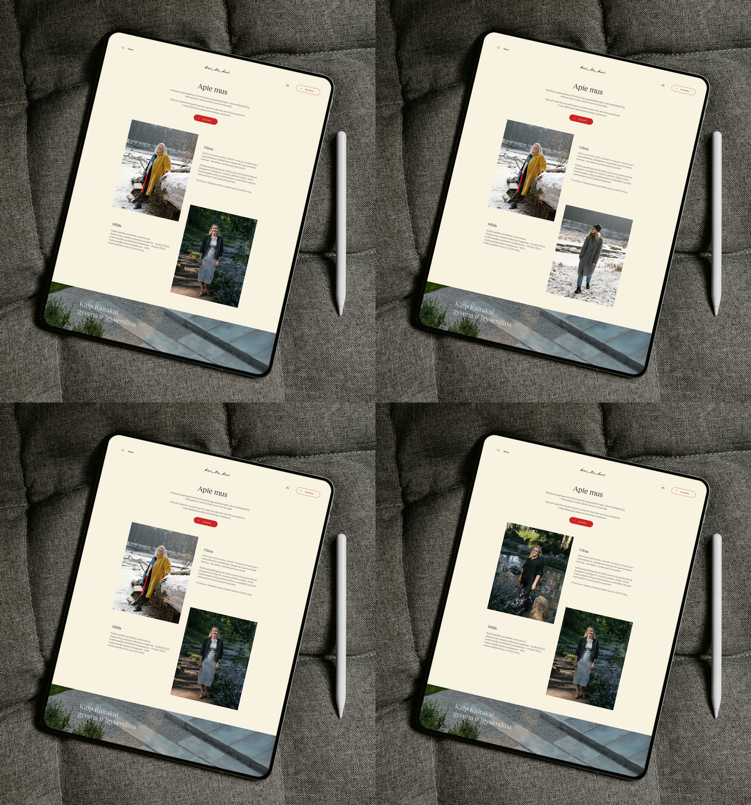
Finally, we liked the idea of constant change so much that we decided to organise seasonal photo sessions for the "about us" section of the website. As another surprise, when you hover over the clients' photos, they instantly switch to another season.
After all, nature is wonderfully unique in both winter and summer :)