Redesigning craft beer labels for Green Monster Brewery
CLIENT Green Monster Brewery
ROLE Illustration & design
accolade Shortlisted at World Illustration Awards 2023
Date 2022
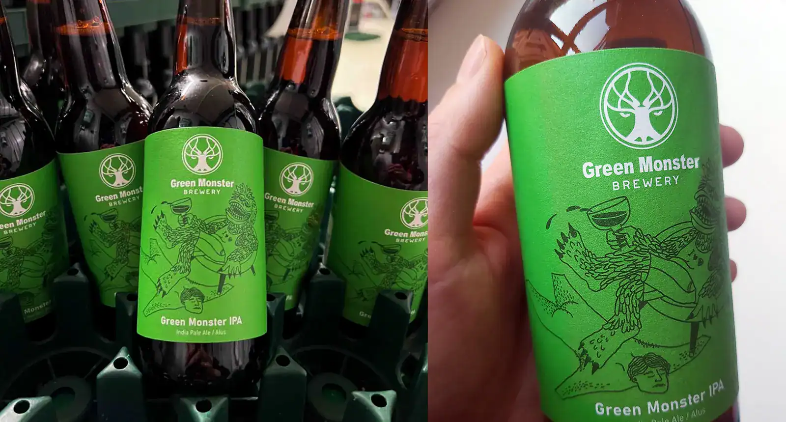
A small, unknown brewery once crafted Green Monster IPA – a beer that unexpectedly gained popularity in bars across Vilnius and Kaunas. This led the owners to rename the brewery in honour of the beloved beer.
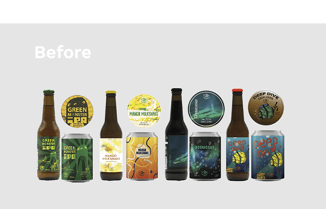
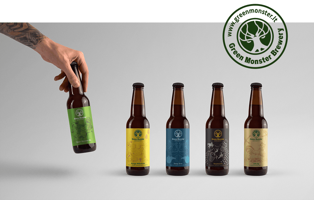
At first, the brewers approached me to design new labels for their existing four beer varieties and one newly created one.
Task & exploration
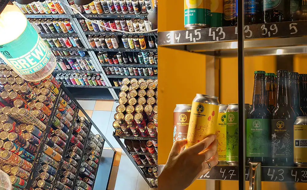
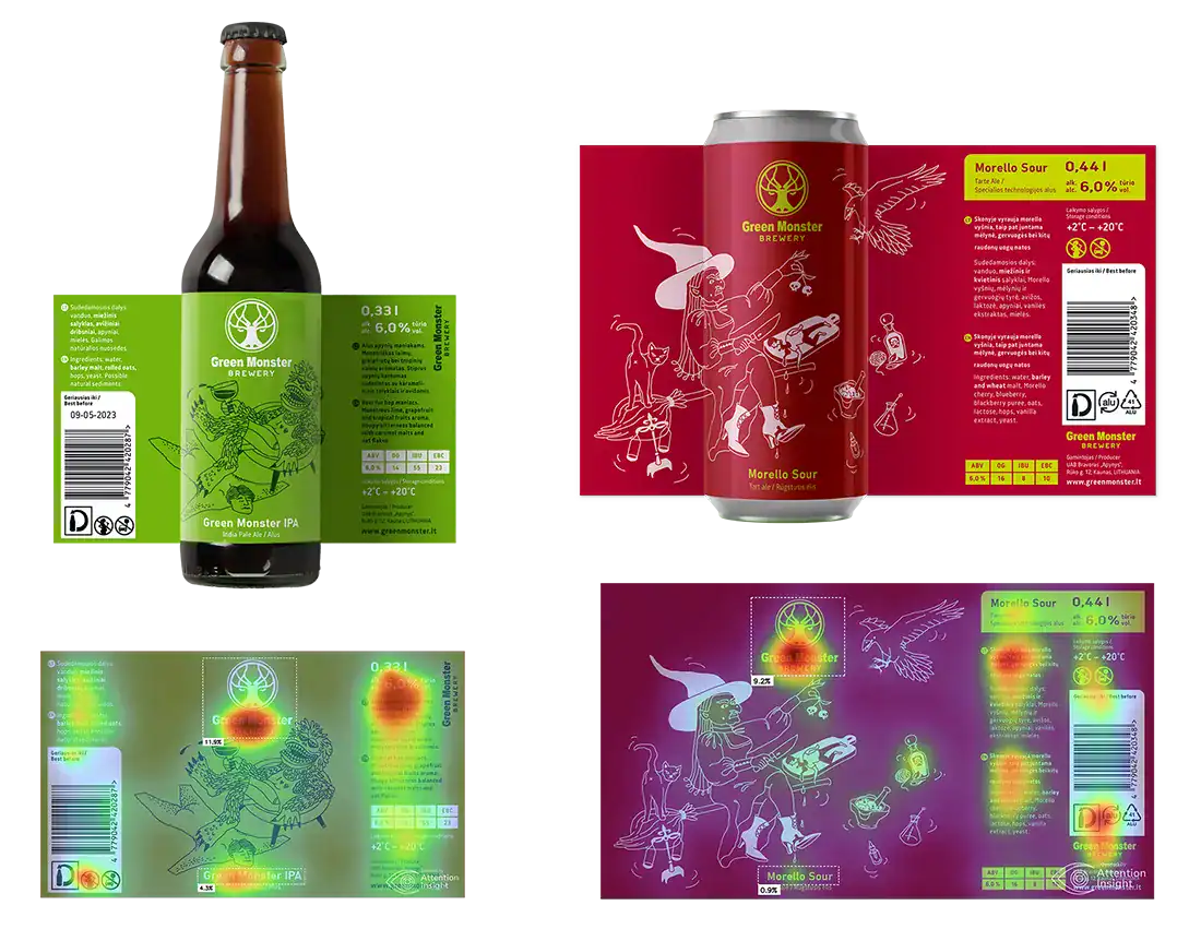
Clients emphasized their preference for a label dominated by a single colour with a central and prominently visible logo. The aim was to ensure the product would stand out in the sea of colours and styles that overwhelm us when approaching the craft beer shelves.
They presented a new brewery logo to me; however, they only had the logo. Hence, the task expanded to include elements for the brewery's visual identity, not just the label system.
As I delved into the exploration stage, it became evident that the folks at Green Monster Brewery envisioned their brand as a modern-day hipster or, perhaps, even a punk – an exciting individual with a marvellous sense of humour.
And they visualized their ideal customer as someone earning above average. This person appreciates quality and stays current with trends without hinting at snobbishness.
Above all, they aimed for the brand to exude a vibe of fun and friendliness.
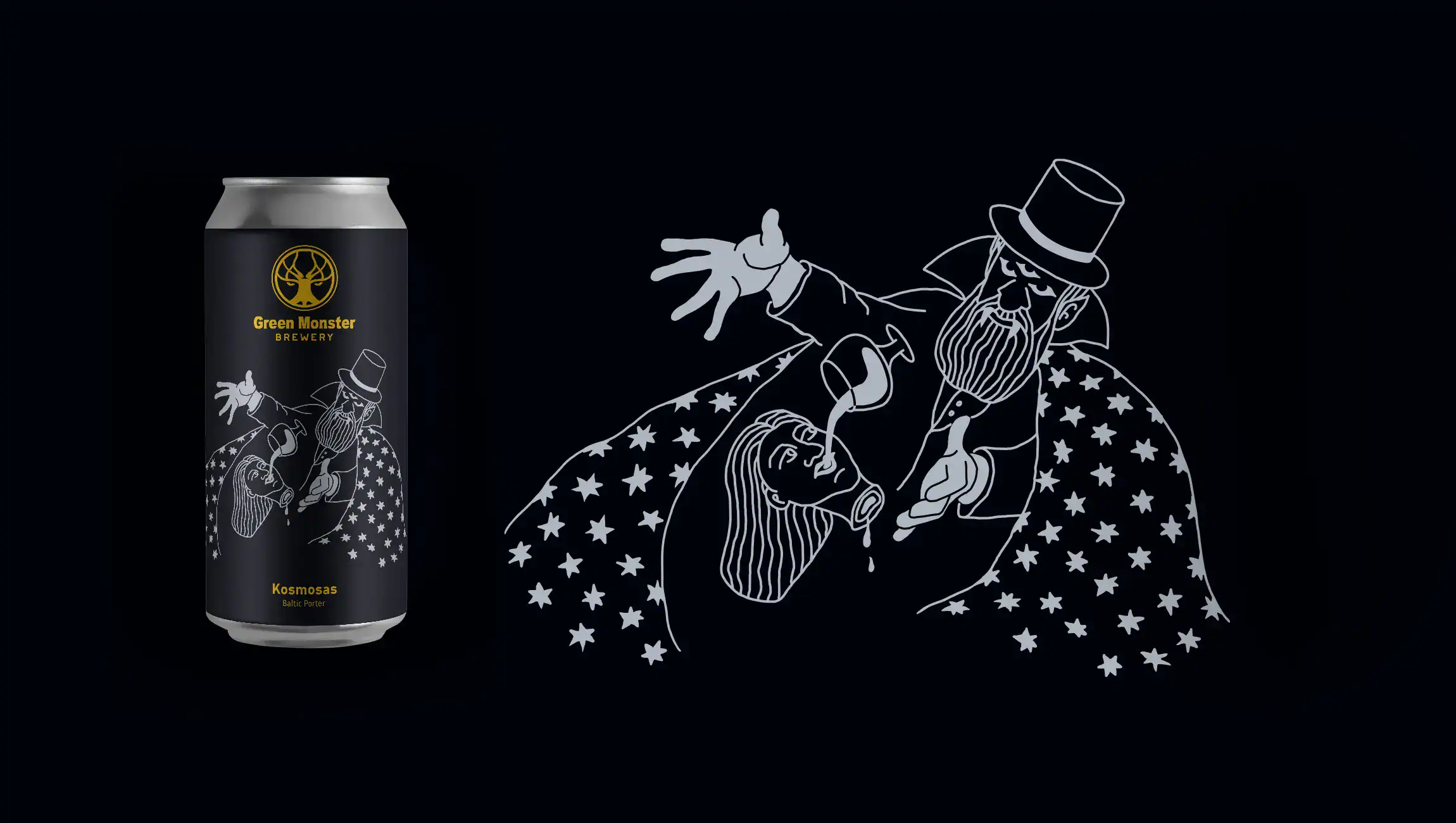
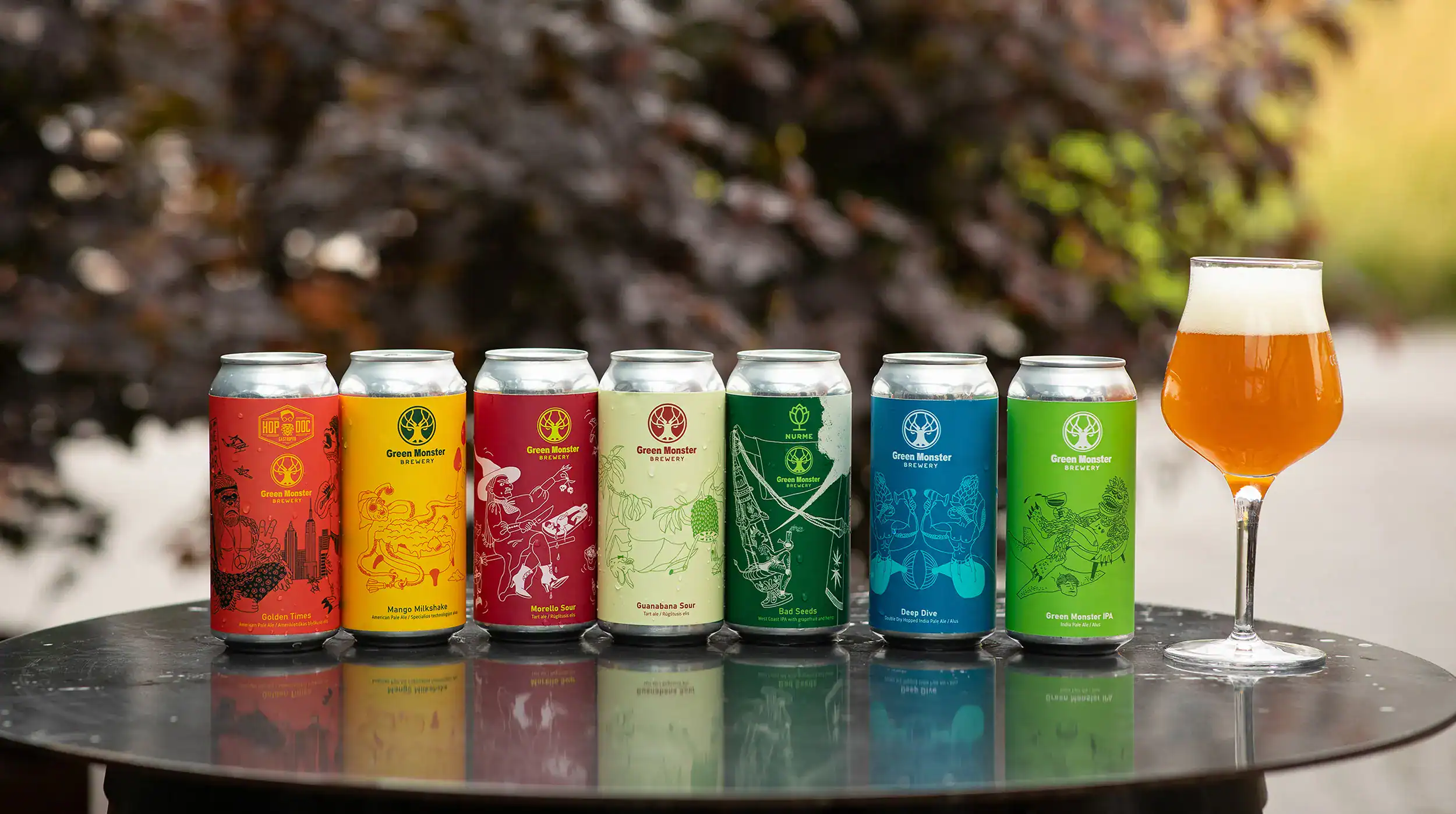
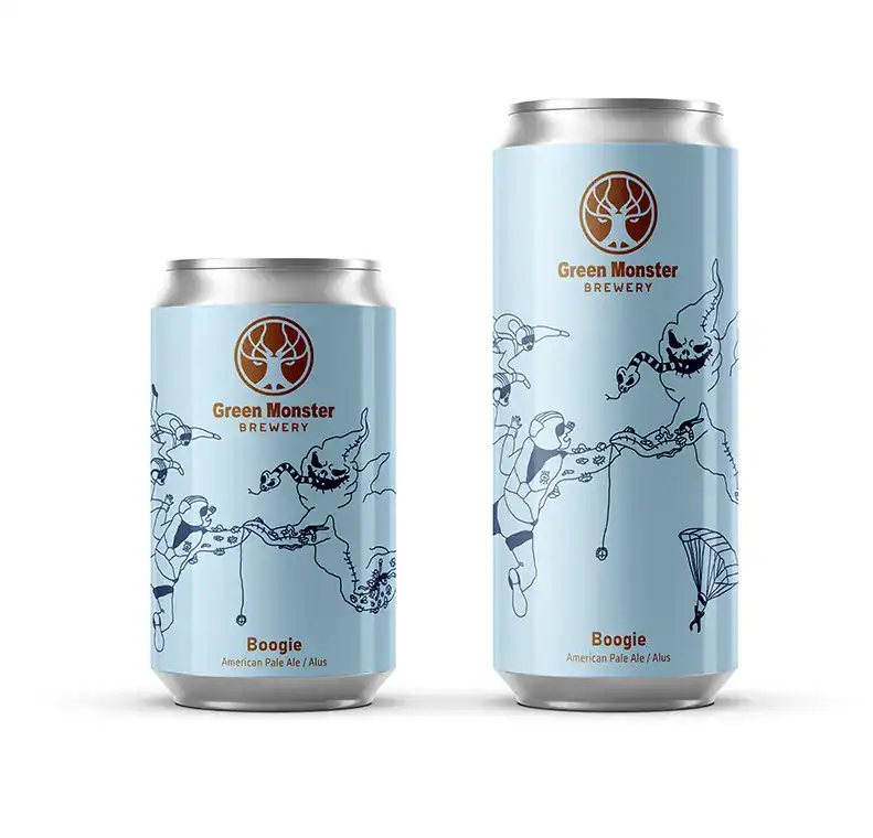
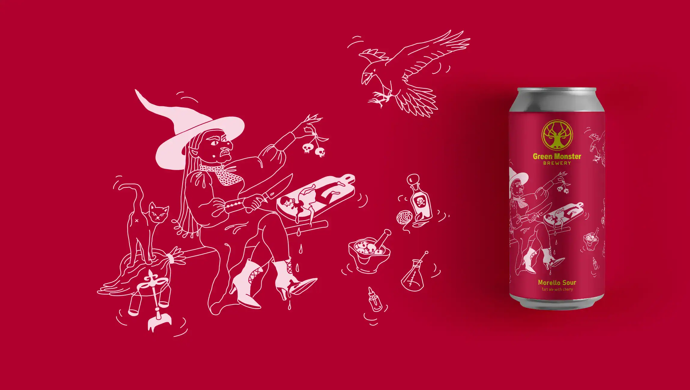
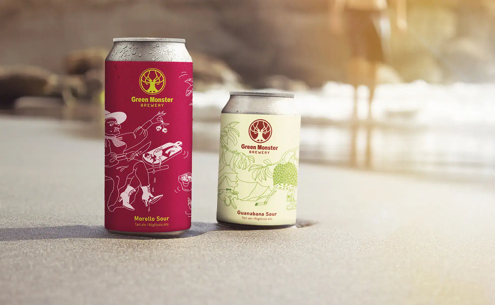
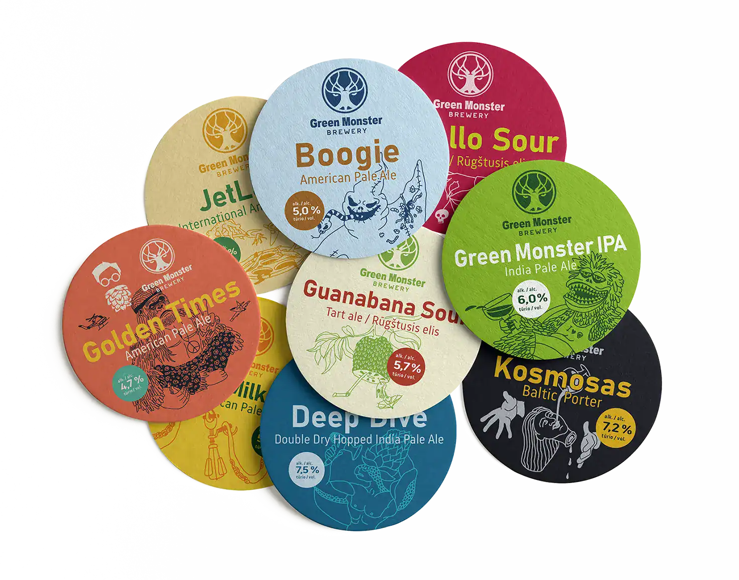
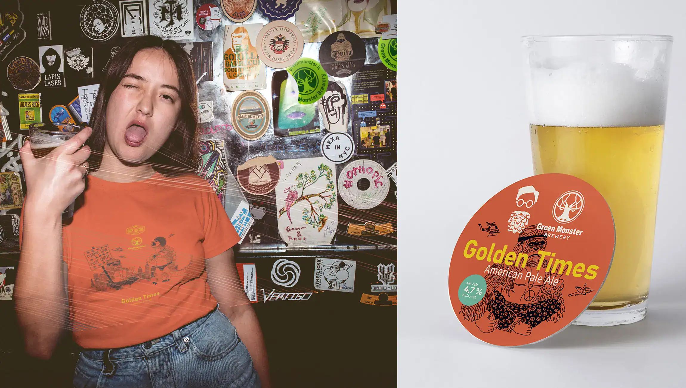
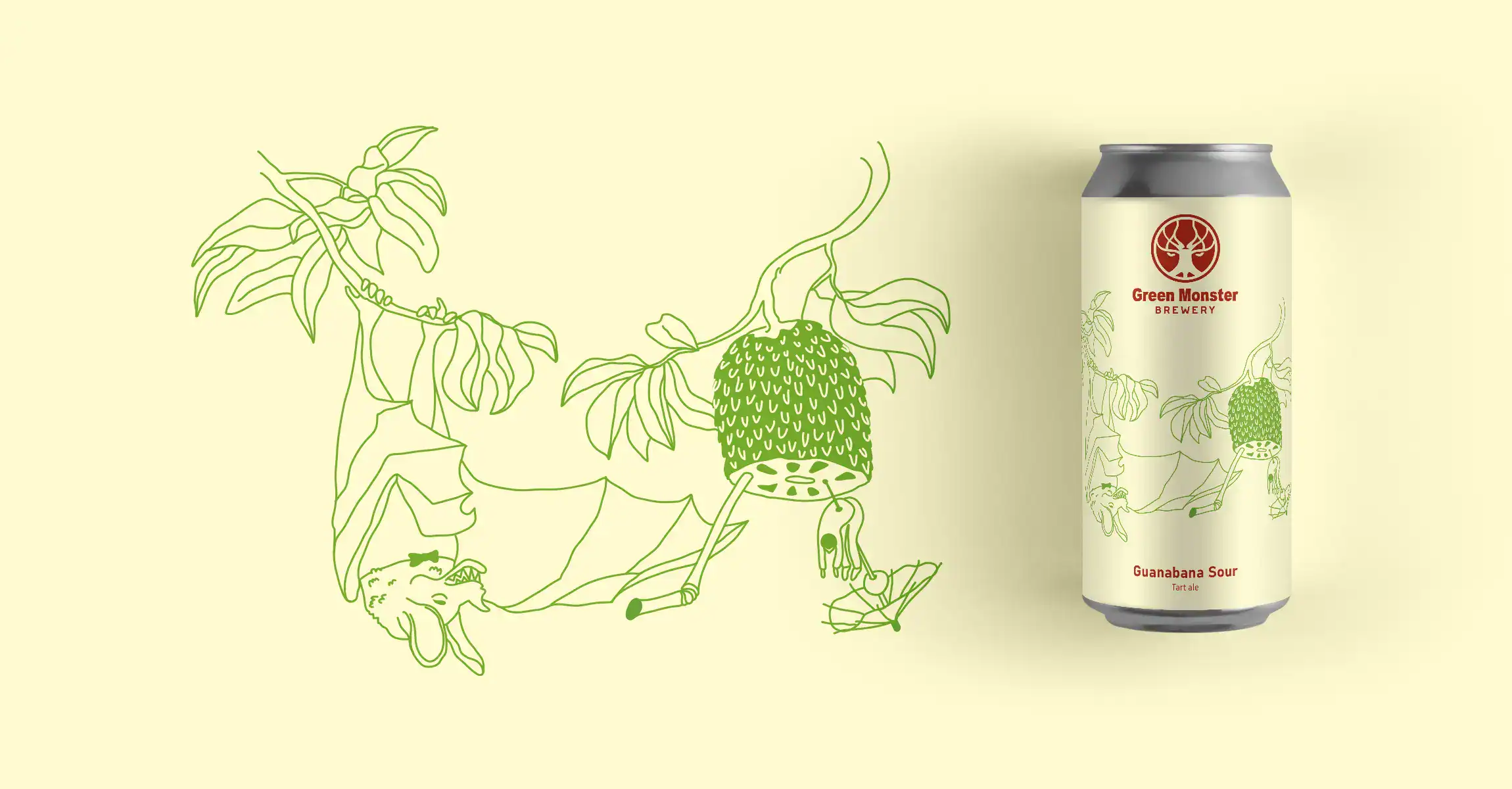
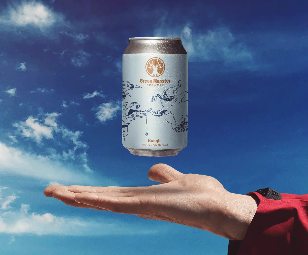
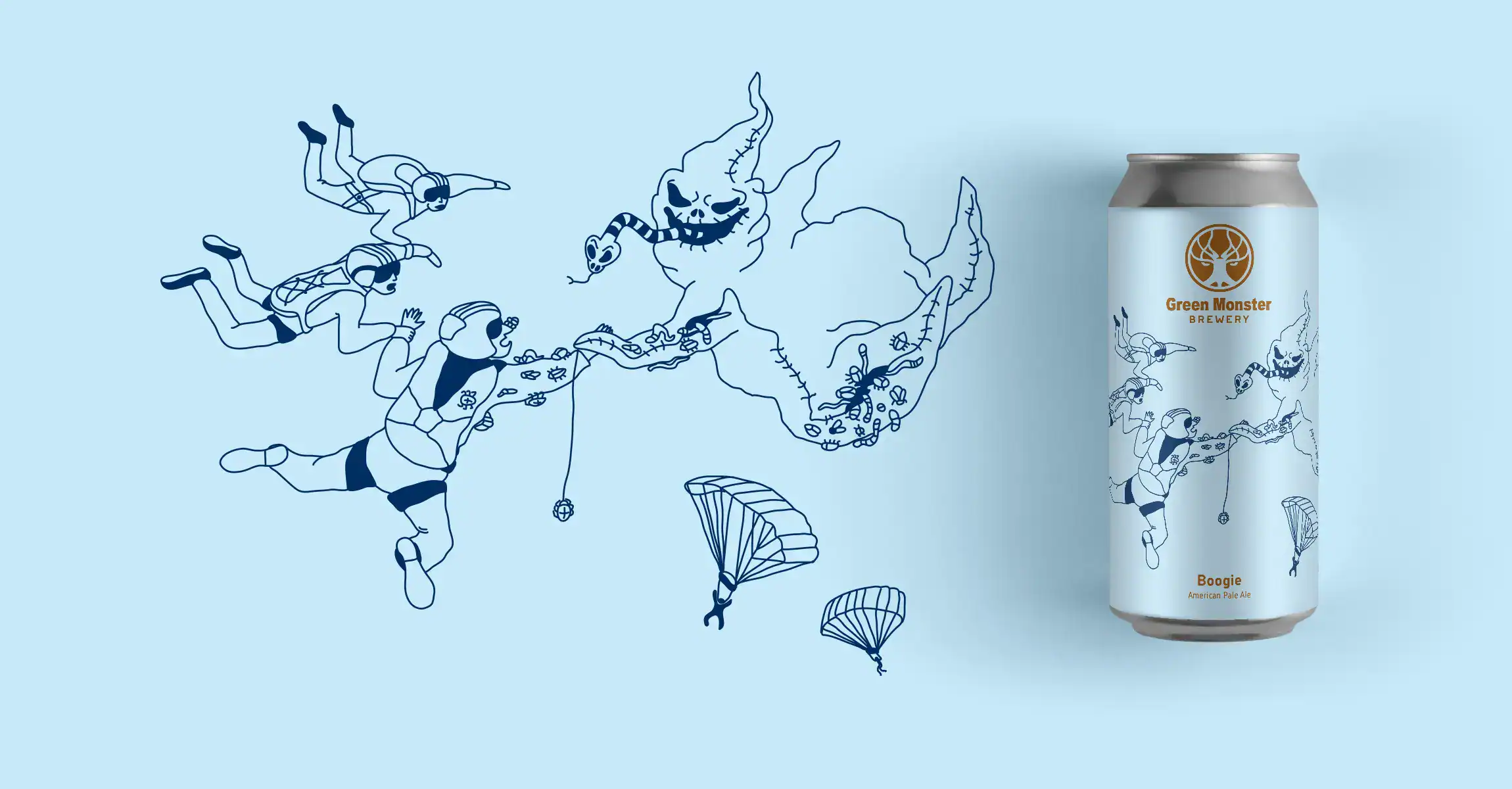
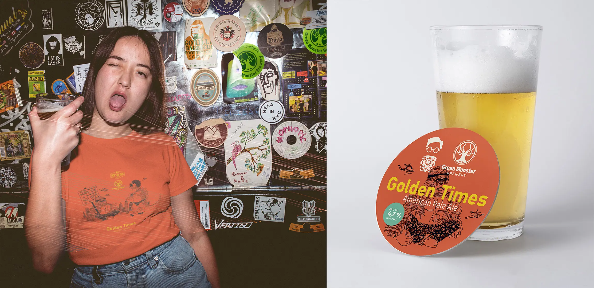
First 5 Illustrations & redesigns for Green Monster Brewery labels.
Creation process & decisions
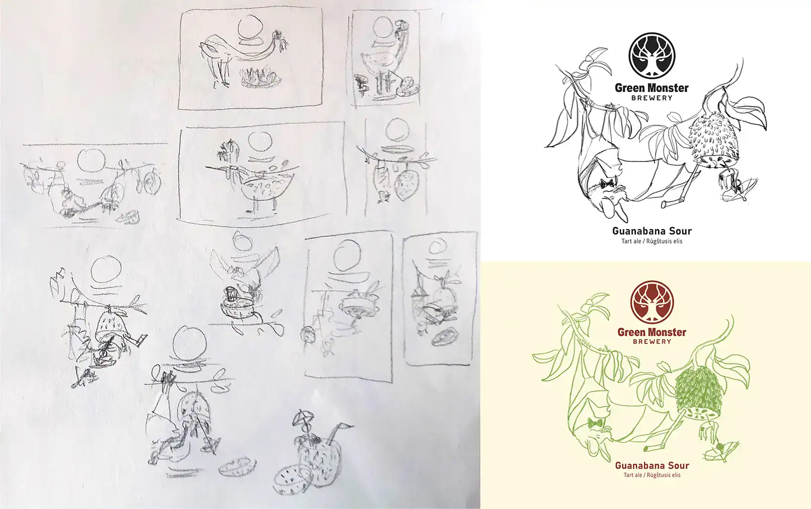
To developed a cohesive label system I have crafted several visual styles based on defined requirements and design constraints.
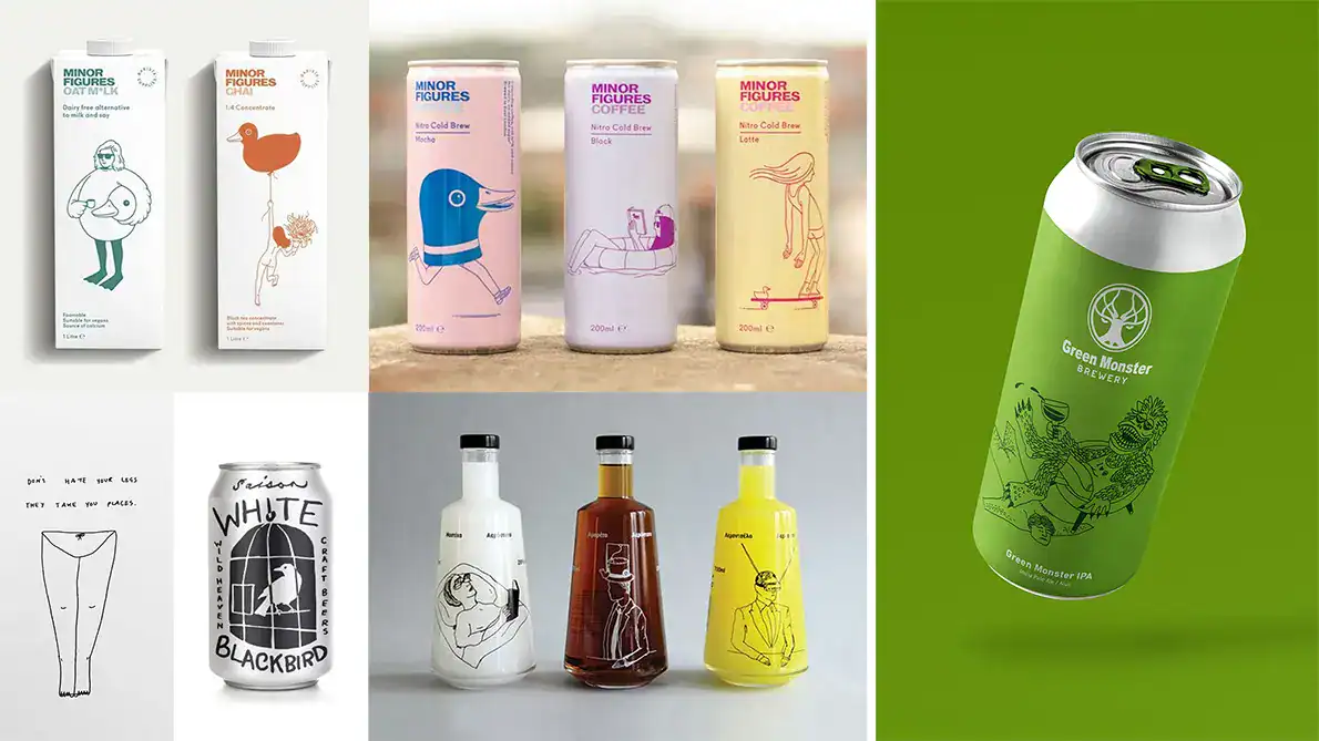
After careful consideration, we settled on the one that balances minimalism with a friendly and witty appearance.
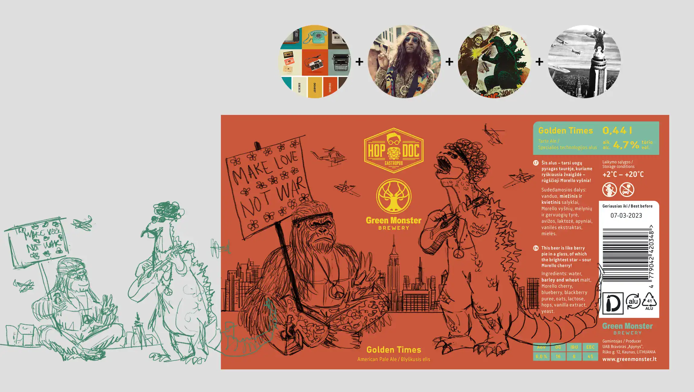
Here is the chosen visual style direction and the label design accomplished according to it. (Images in the mood board are taken just as a reference from the Internet)
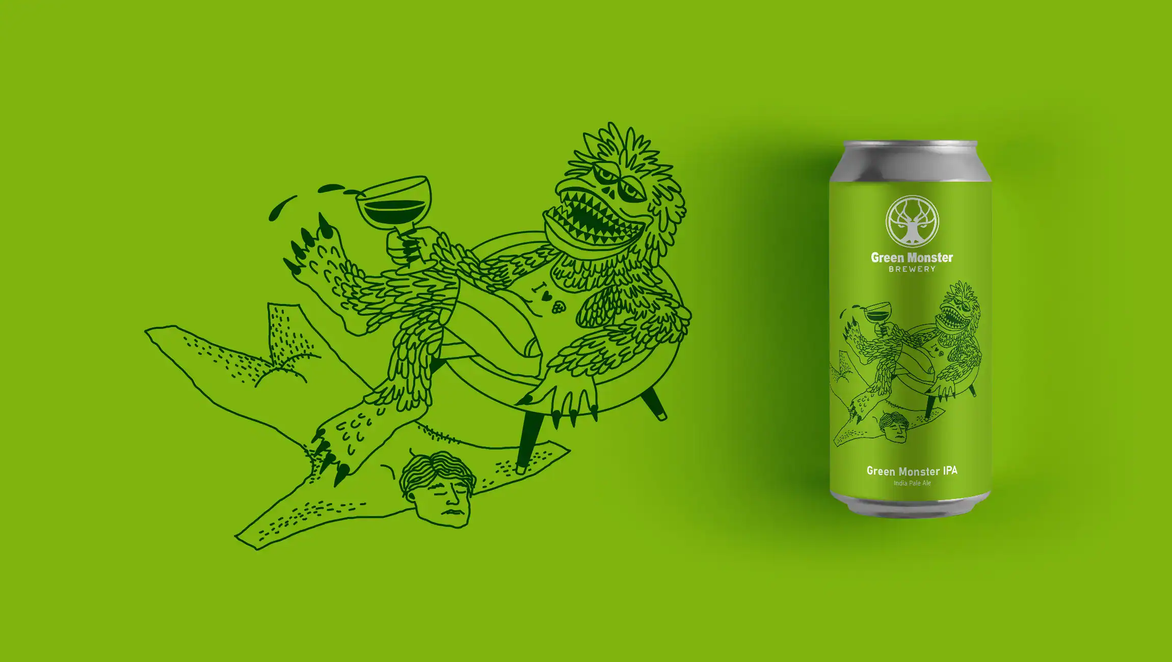
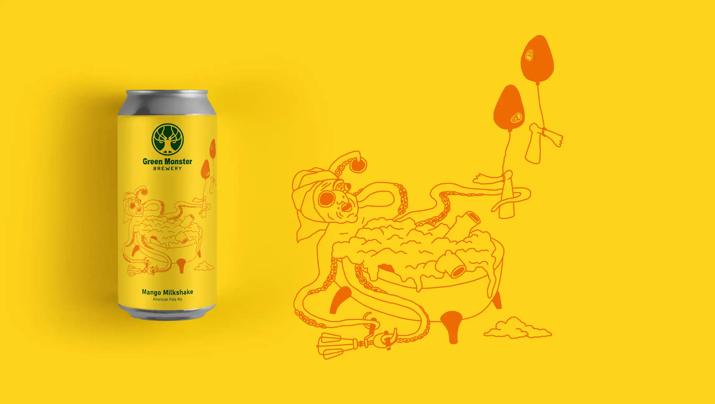
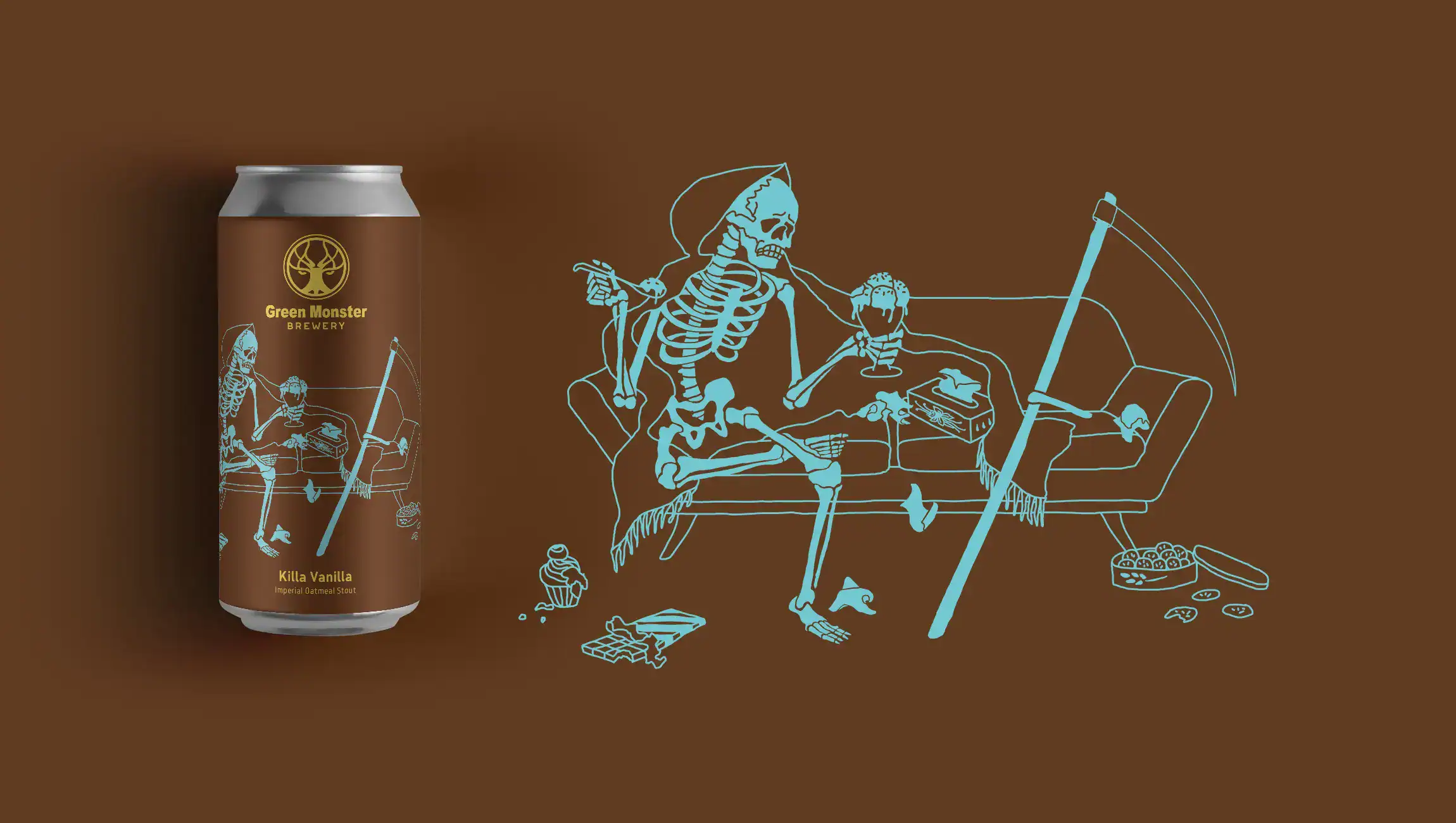
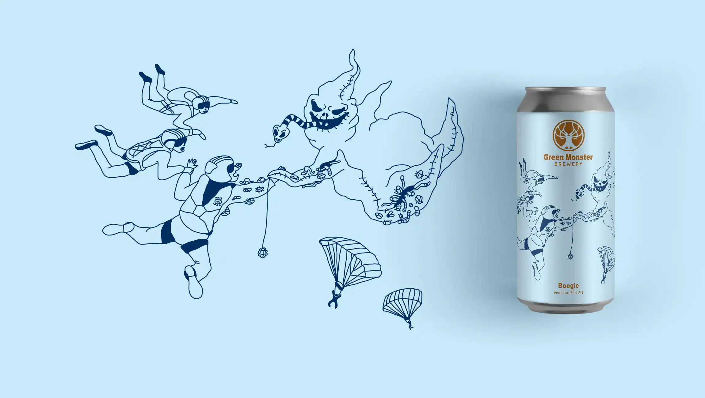
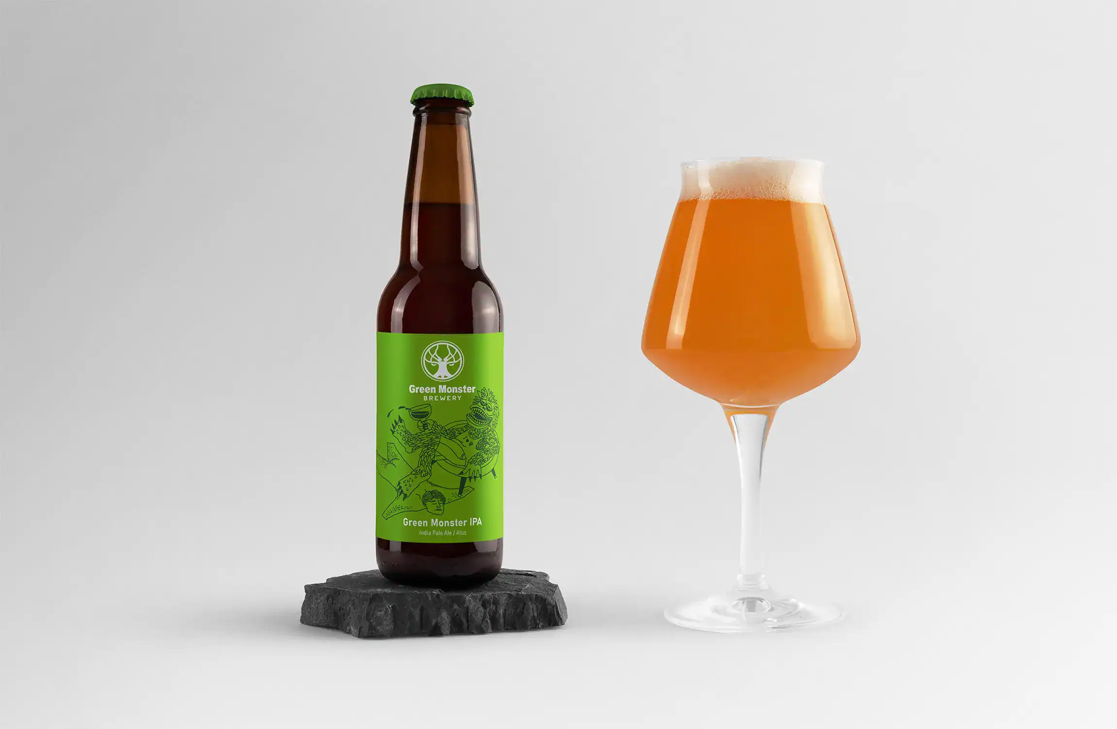
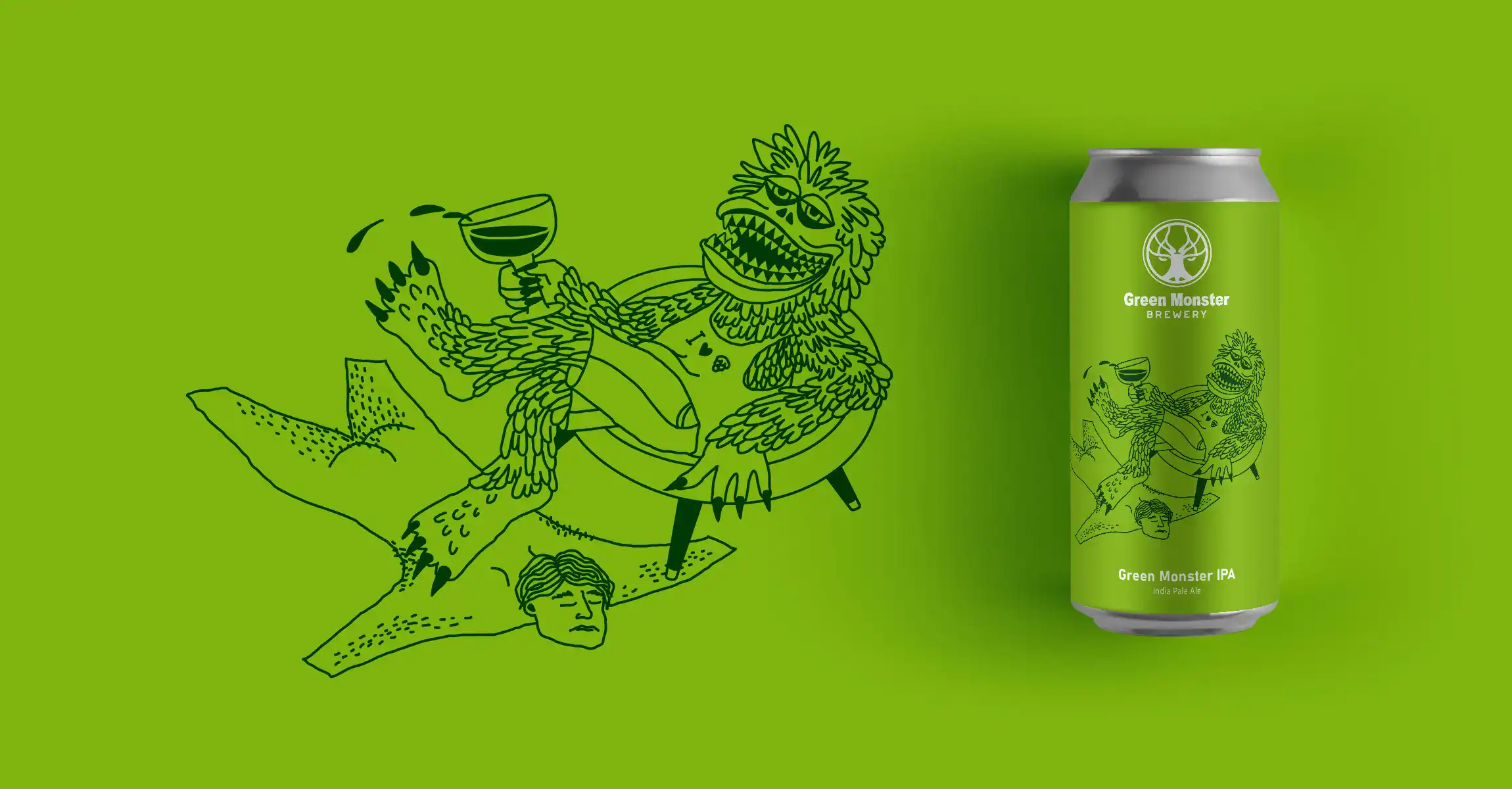
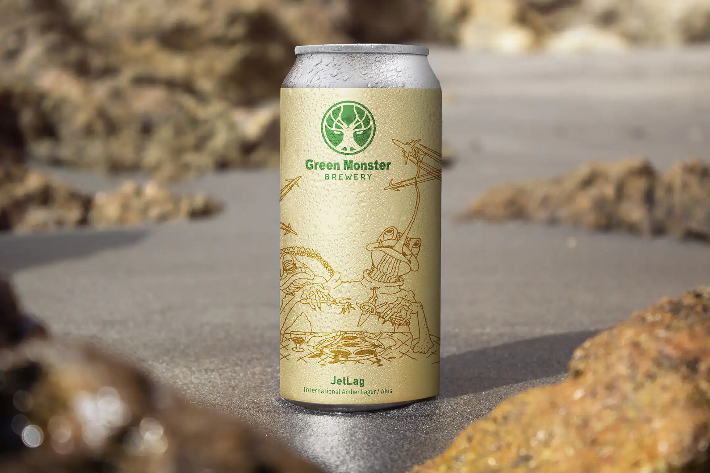
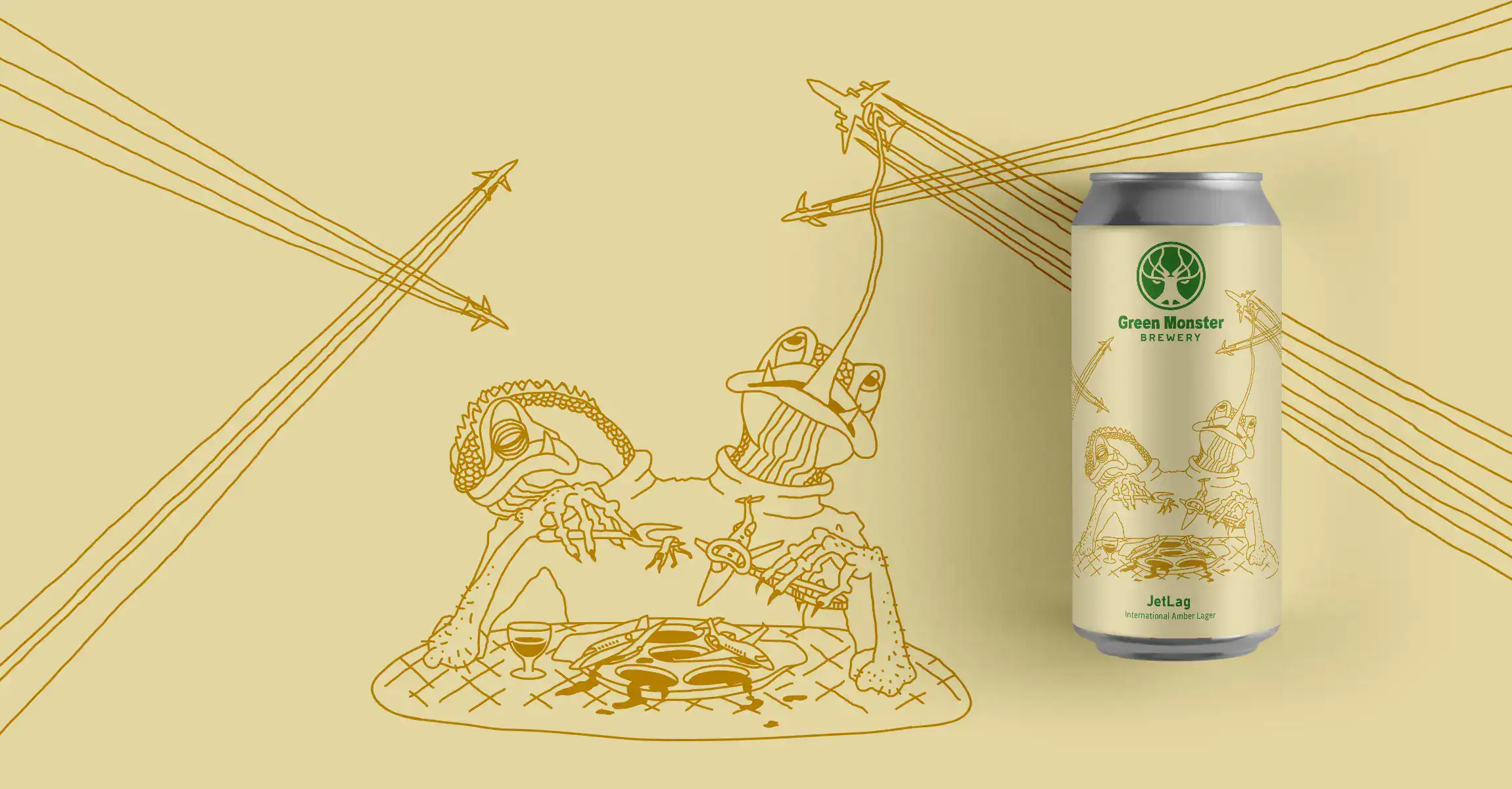
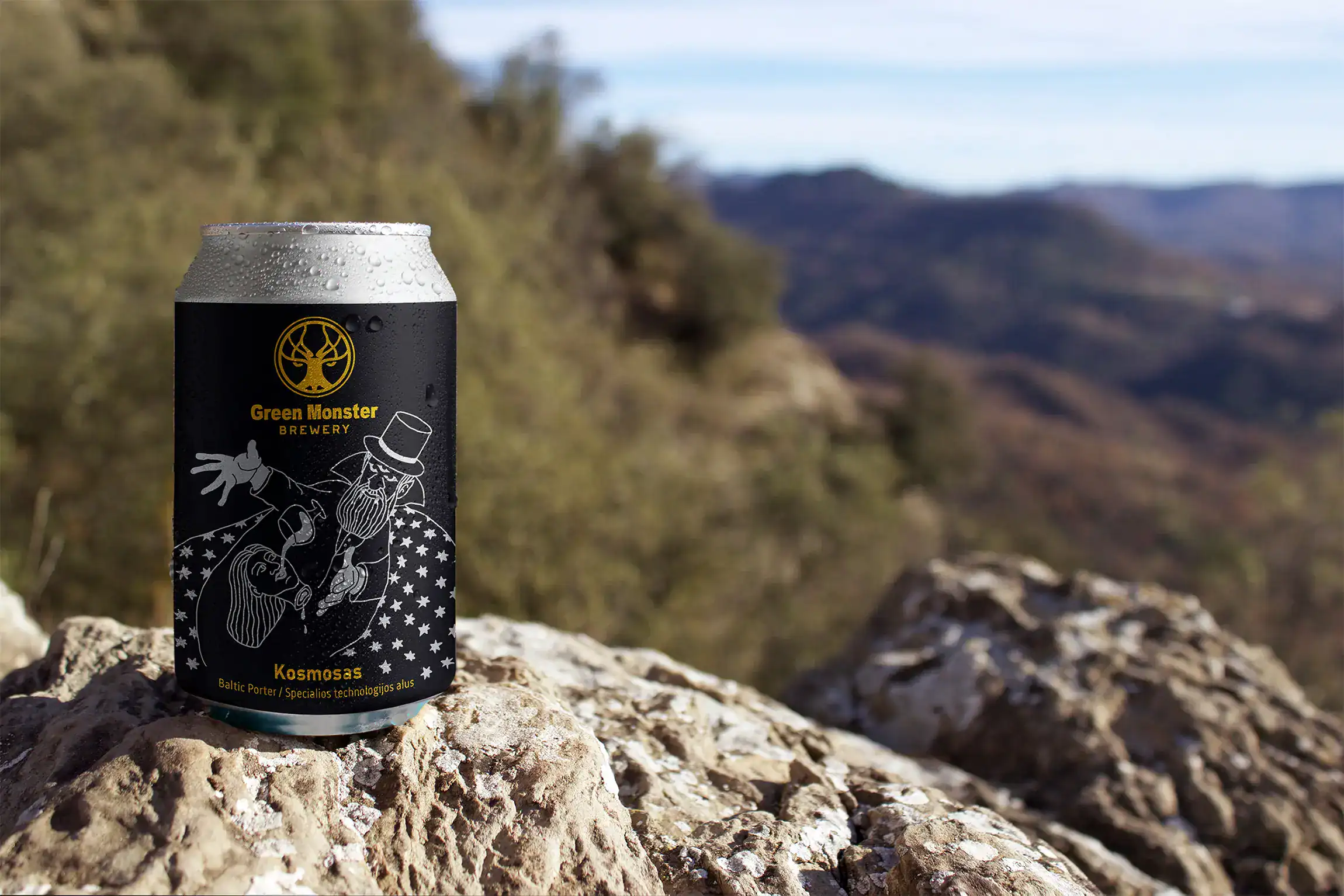
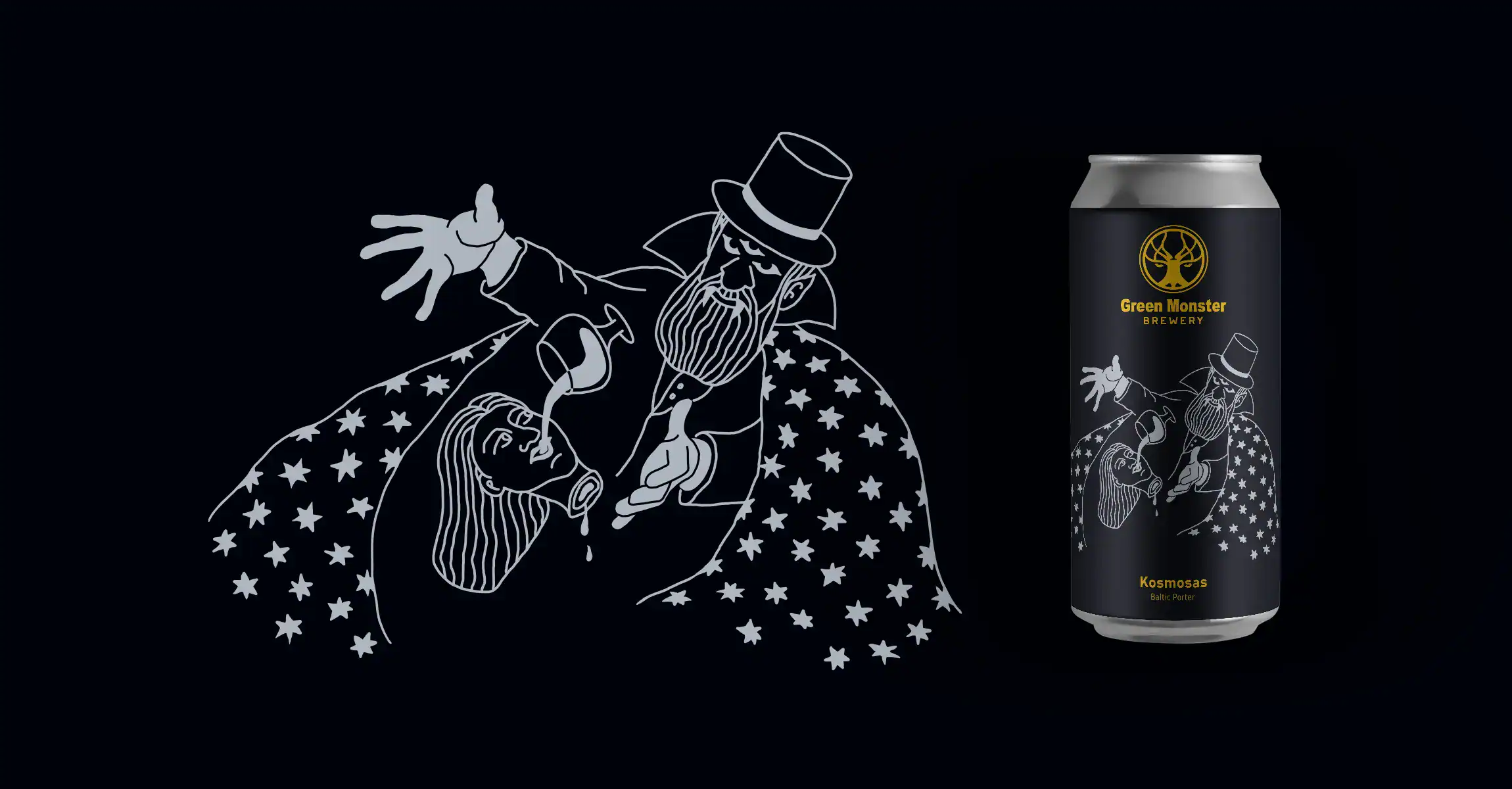
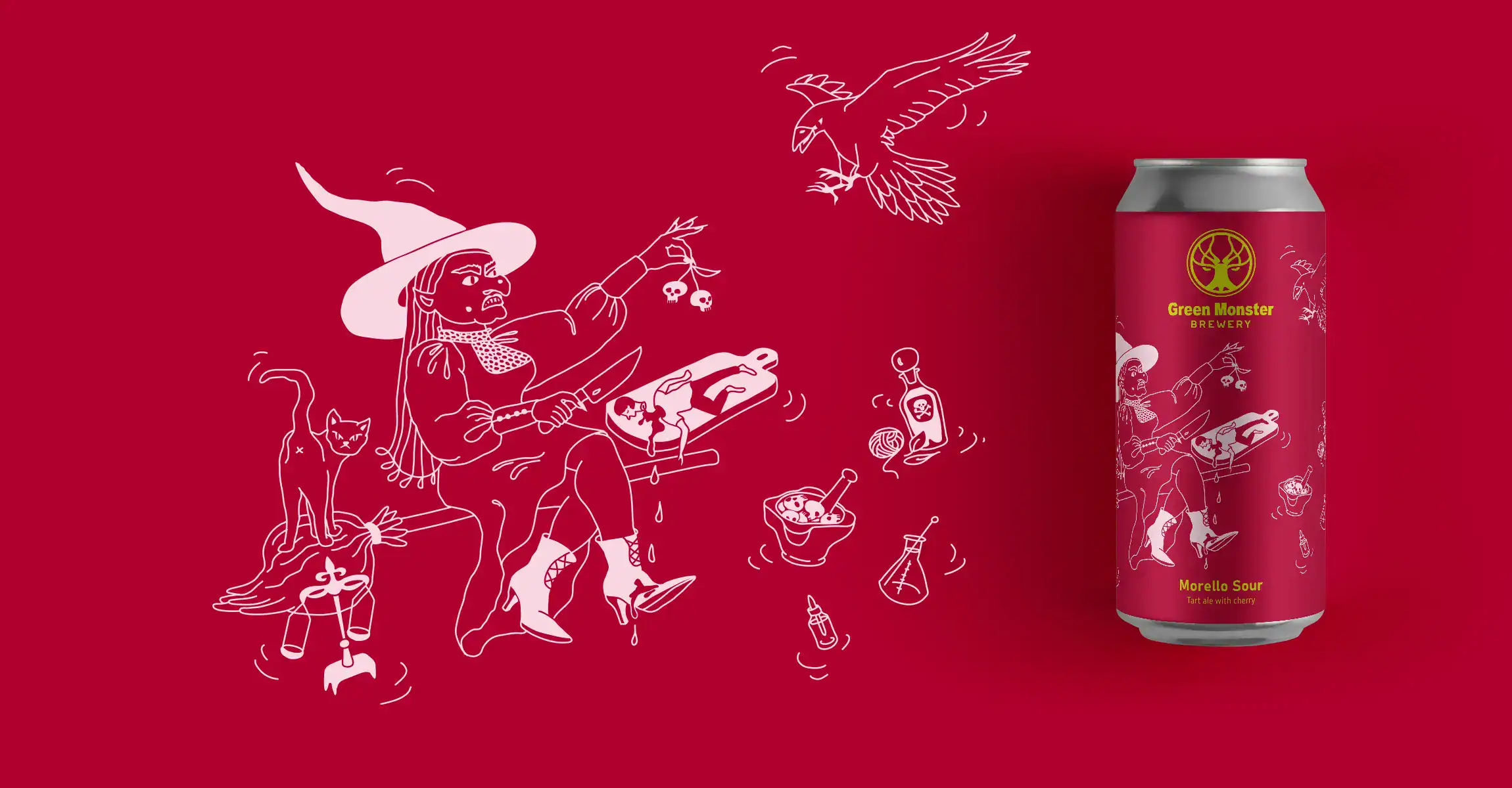
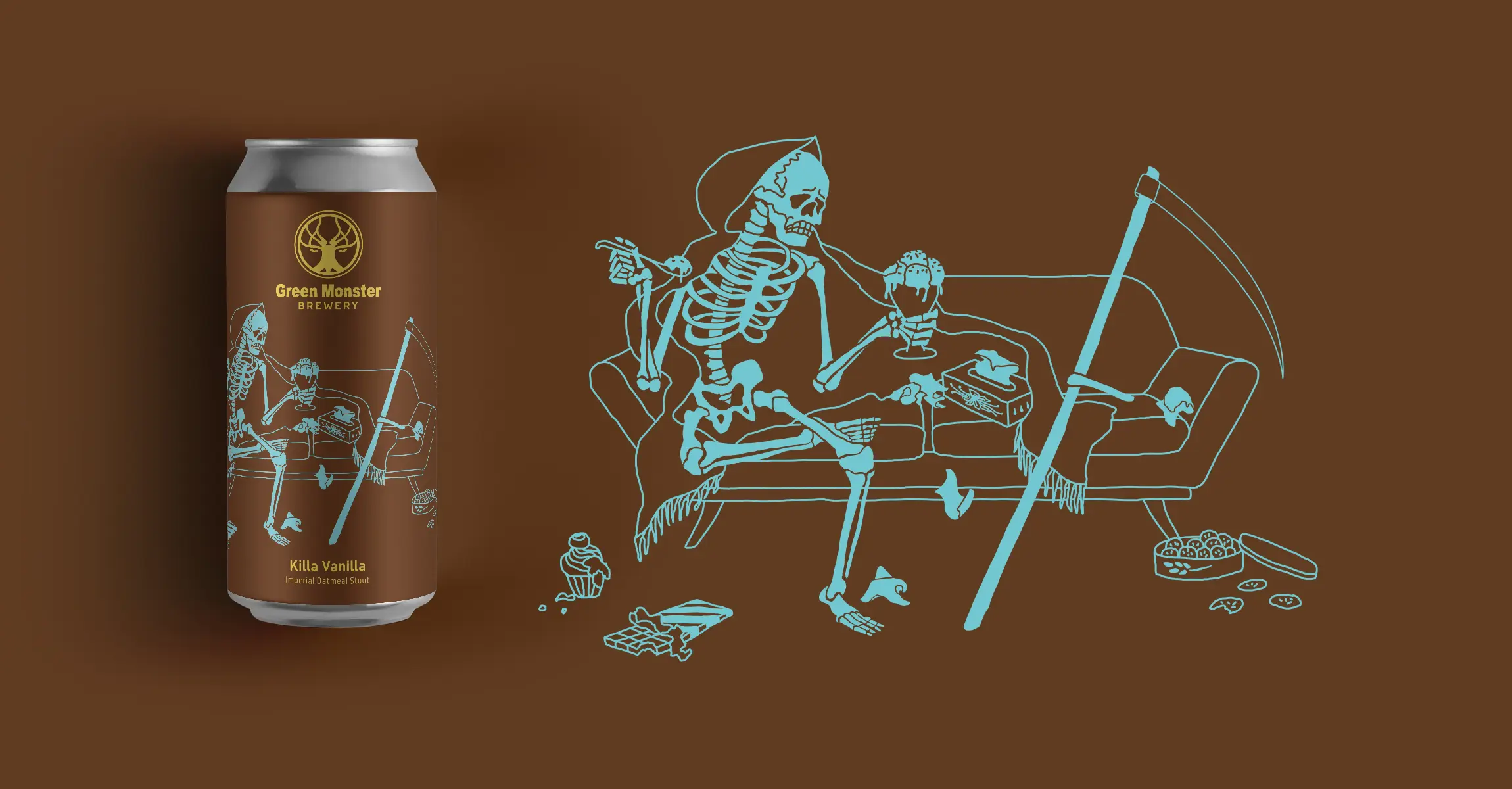
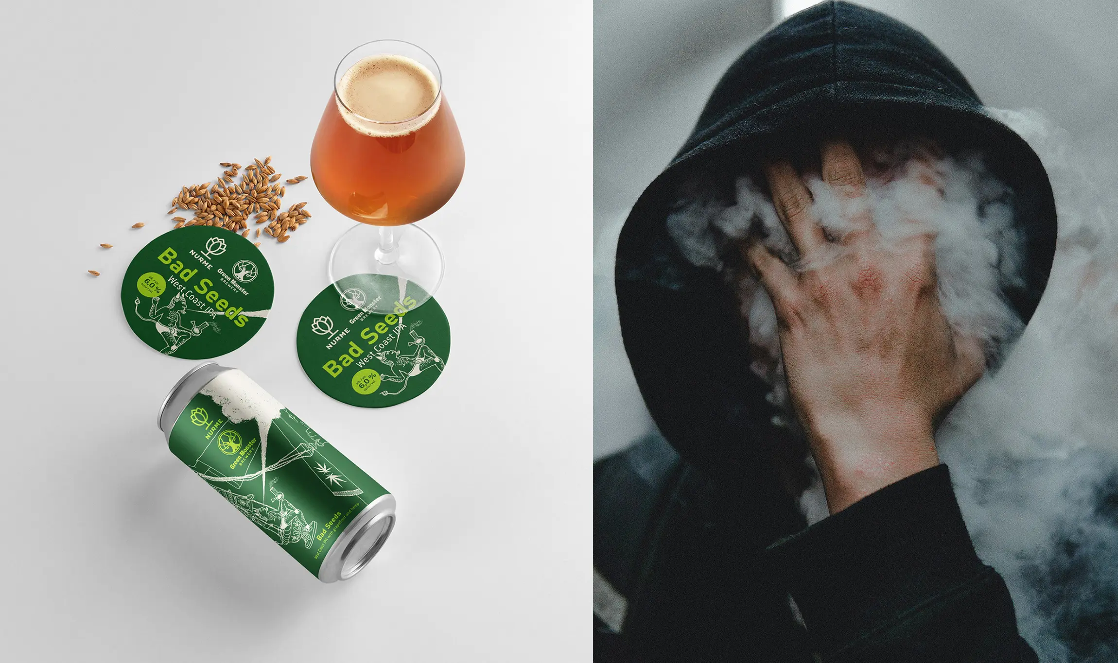
In line with the chosen visual direction, I have used a primary colour scheme that reflects the unique characteristics of each beer. However, I introduced two additional colours - the most contrasting for the logo and the least contrasting for the humorous character, depicted using a single-weight line.
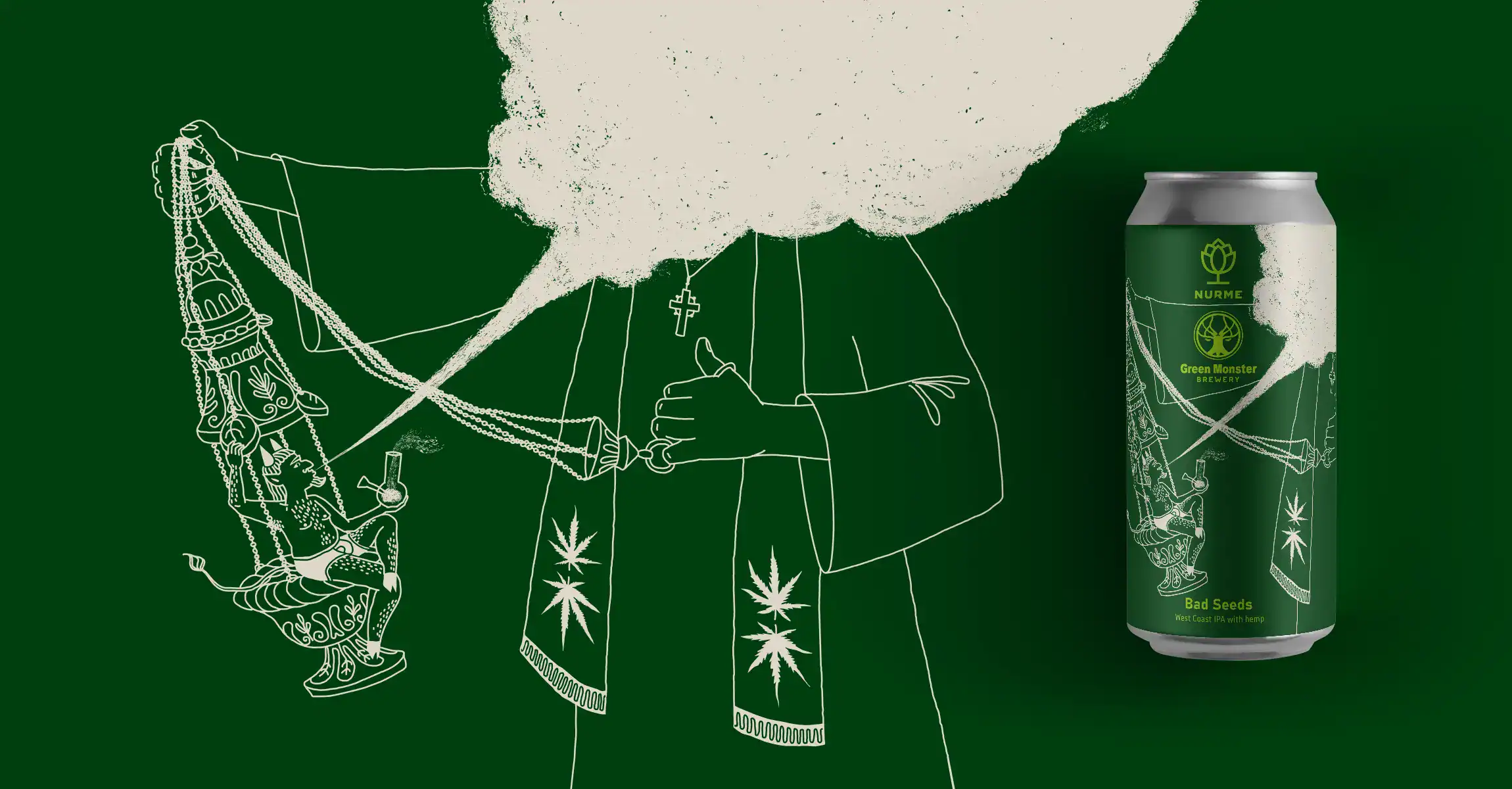
We came up with the idea that each new beer character should connect to the monster theme. This not only aligns with the brewery's name but also opens up endless creative possibilities.
Every new beer should tie into the monster theme and have a primary colour that reflects its distinctiveness.
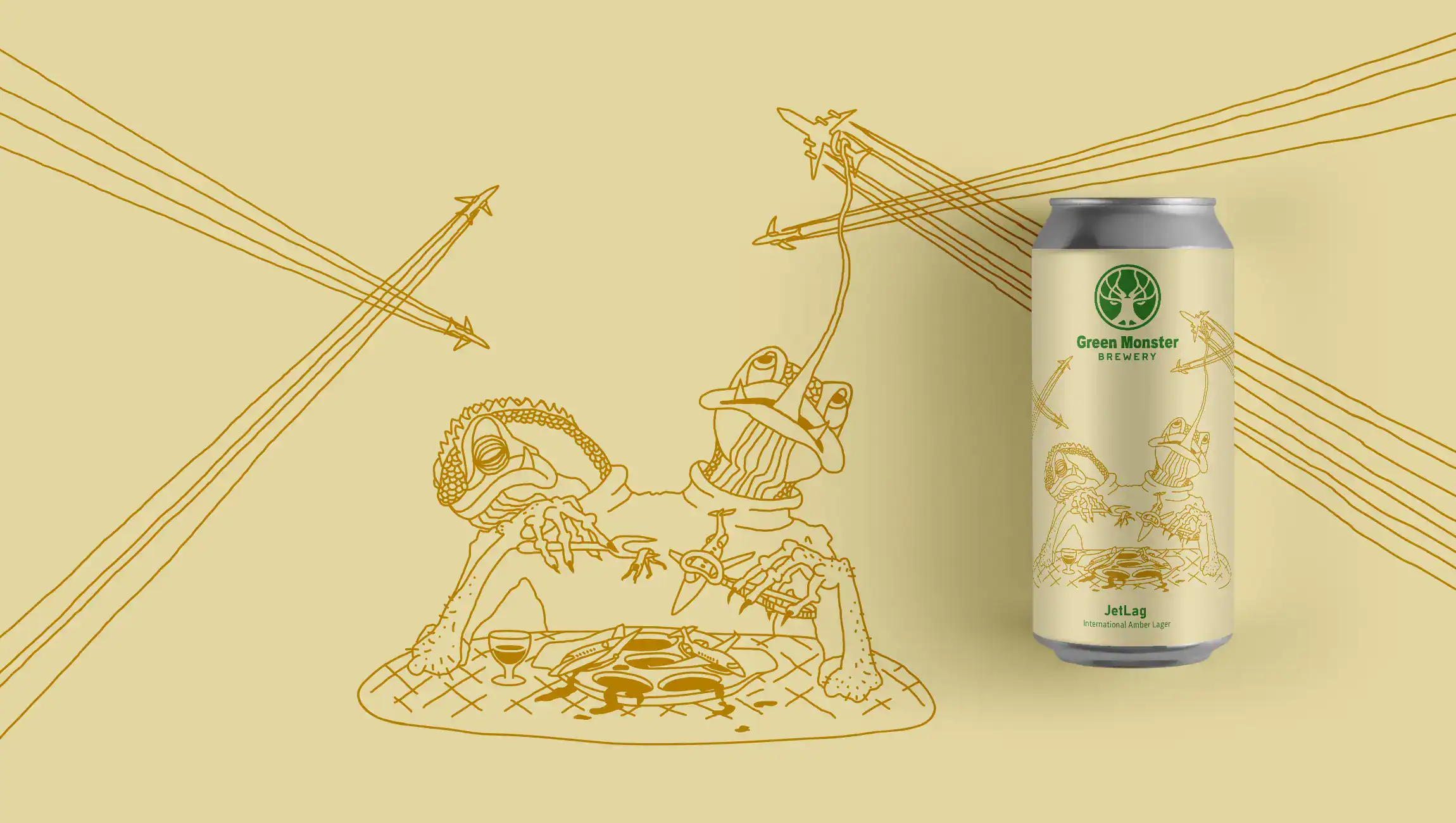
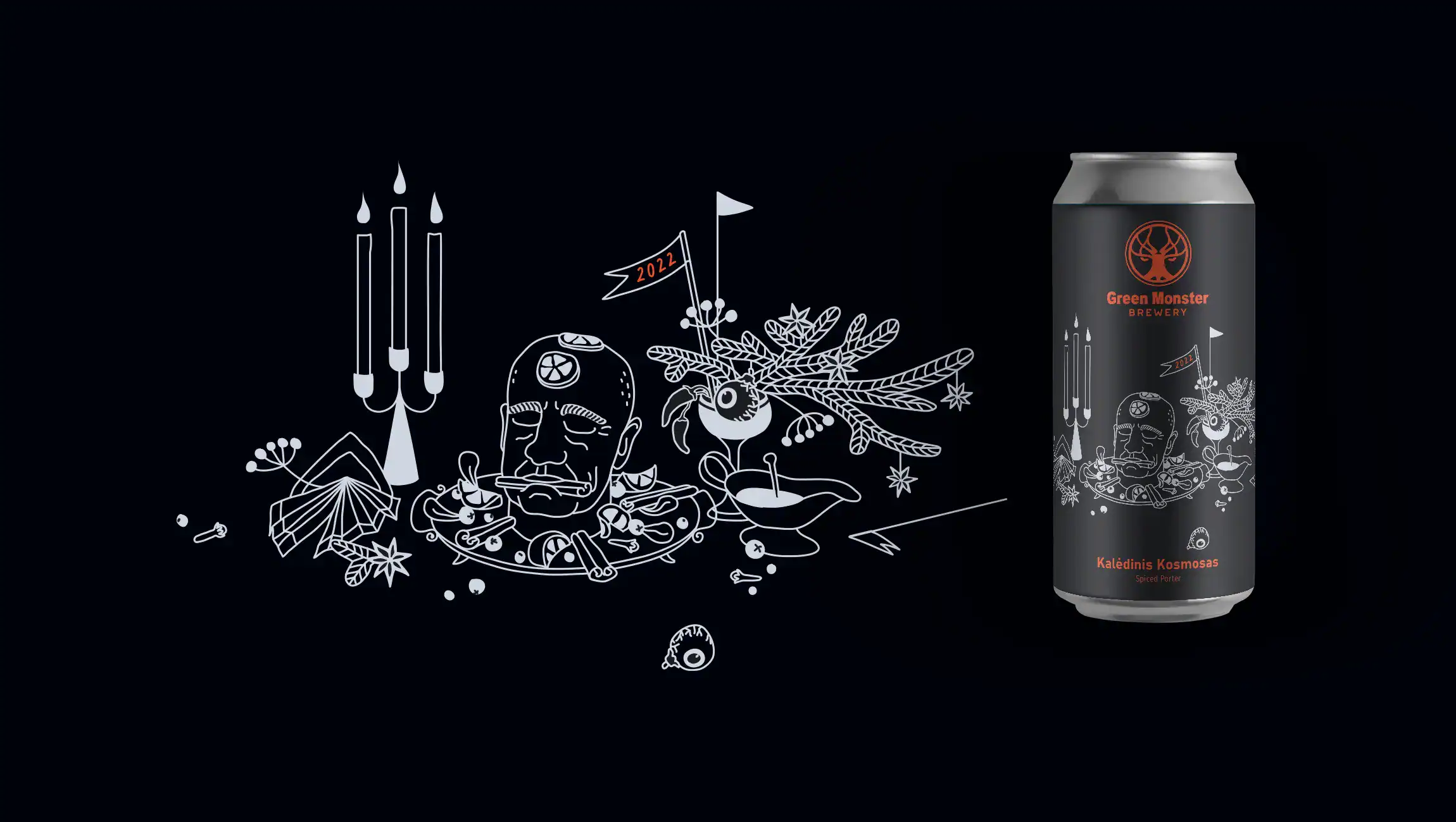
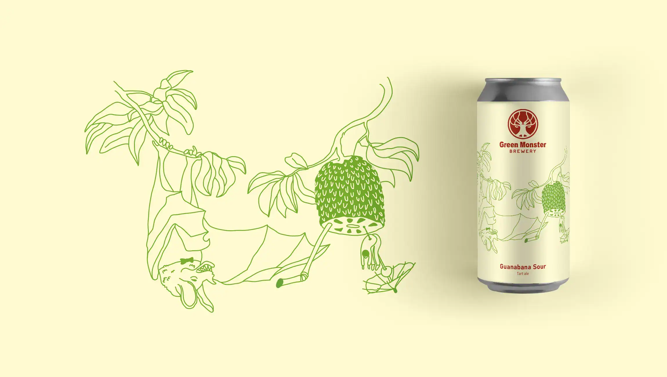
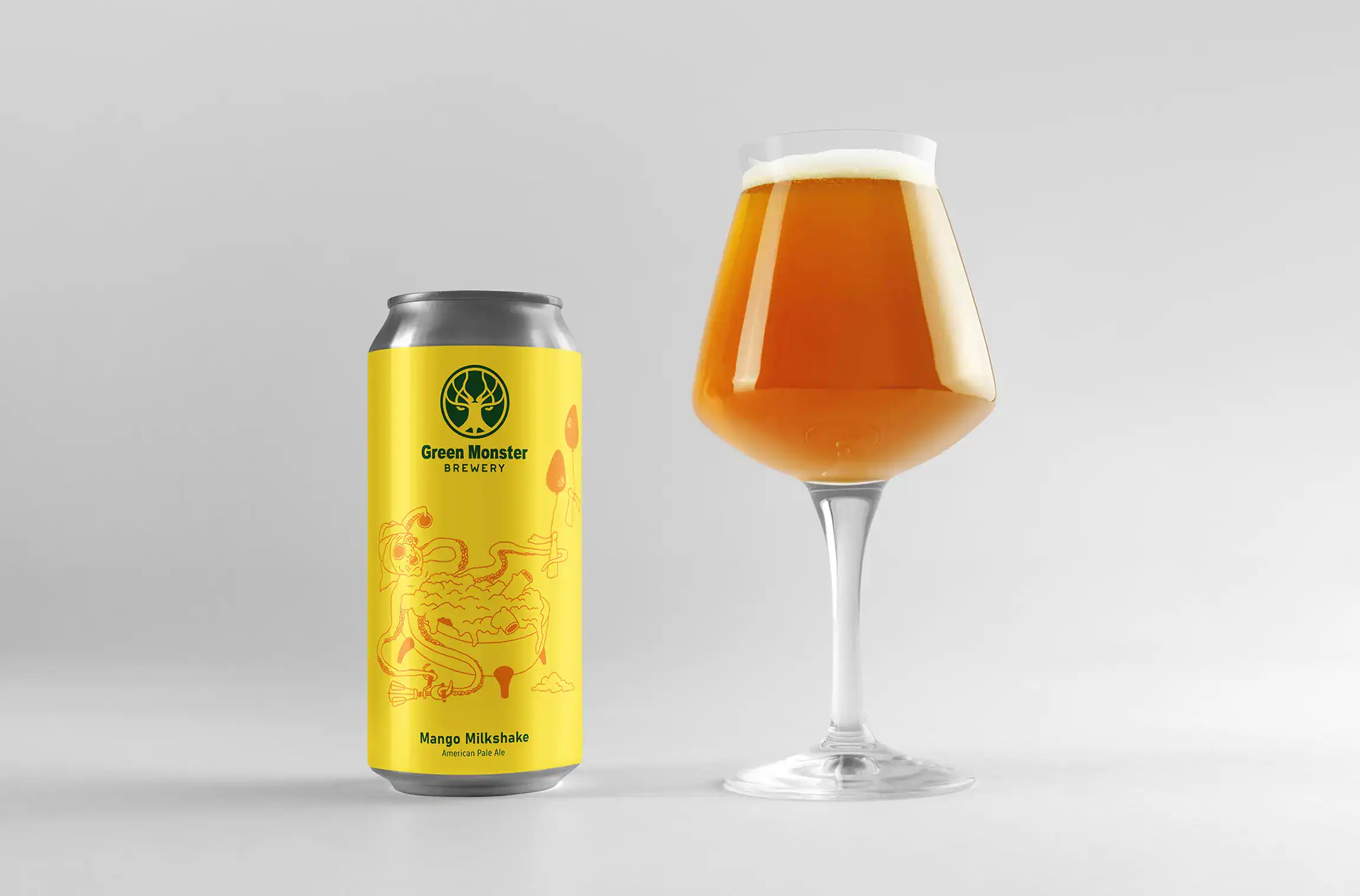
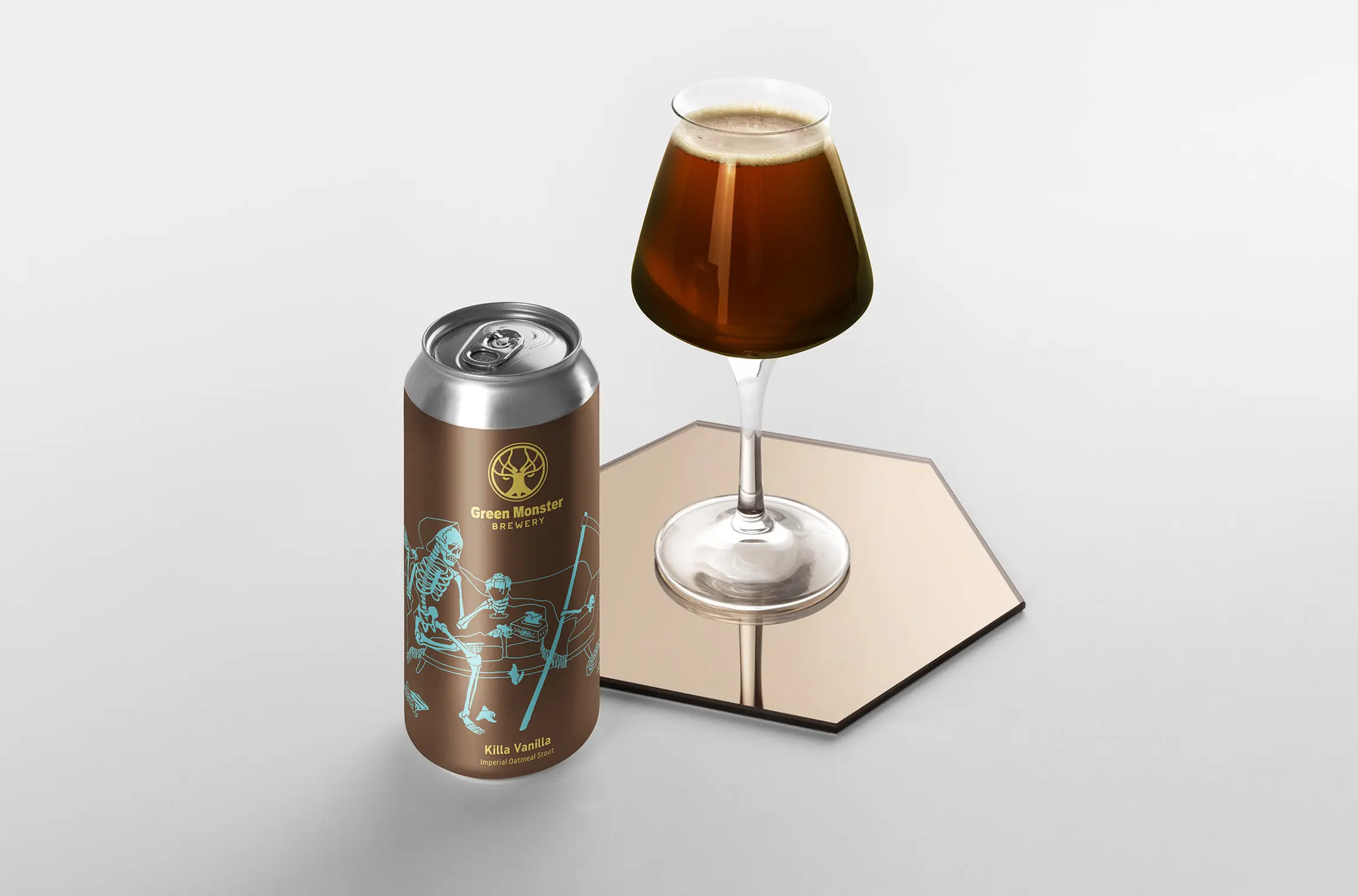
5 more illustrations for later developed beer sorts
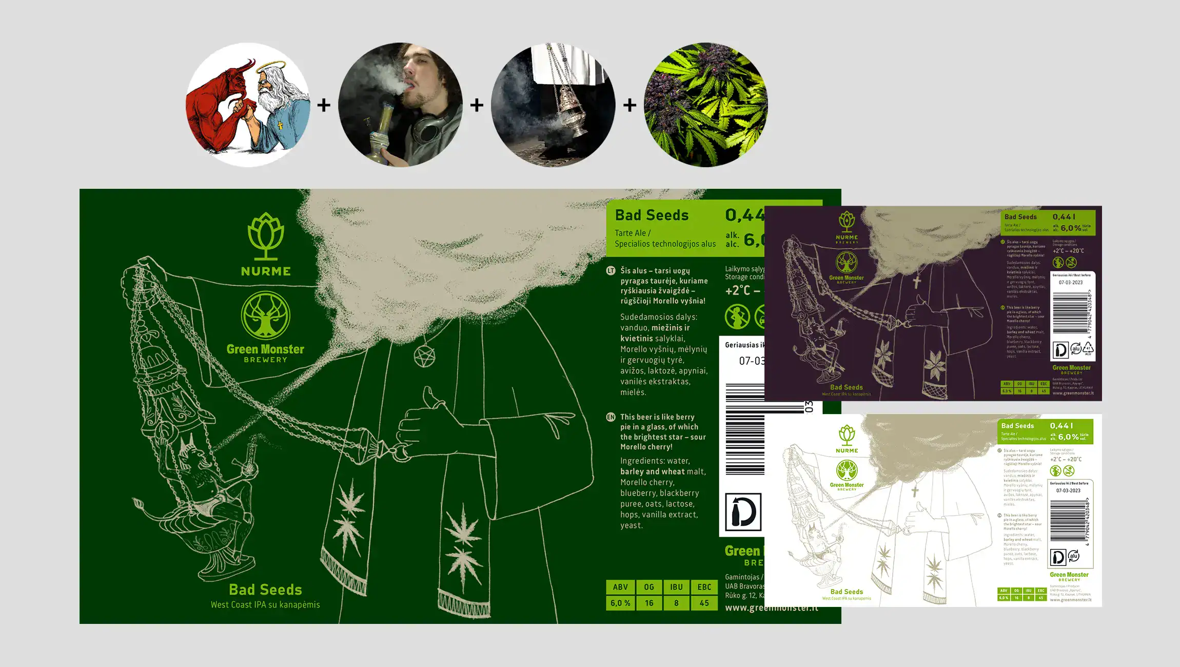
During the creative process, I focus on the unique flavours of the particular Green Monster brew and try to capture the essence of this type of beer. I also consider the stories and characters associated with the beer's name and imagine the tales it might evoke.
Additionally, I take into account the inherent characteristics, hobbies, and behaviour of the ideal audience for this brew. Unexpected and intriguing combinations are created by trying to blend all these ideas.
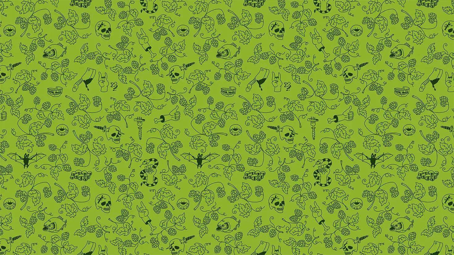
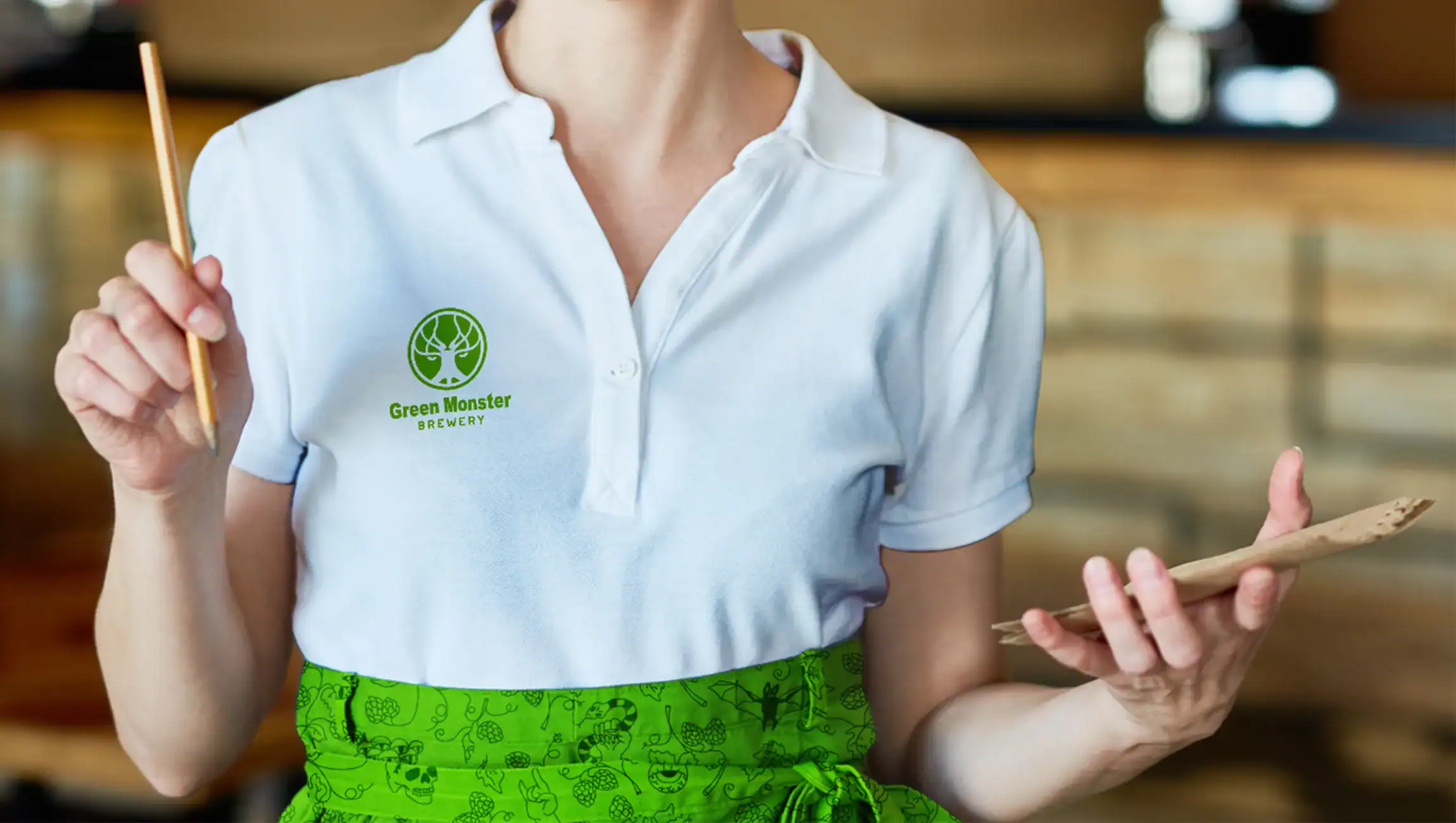
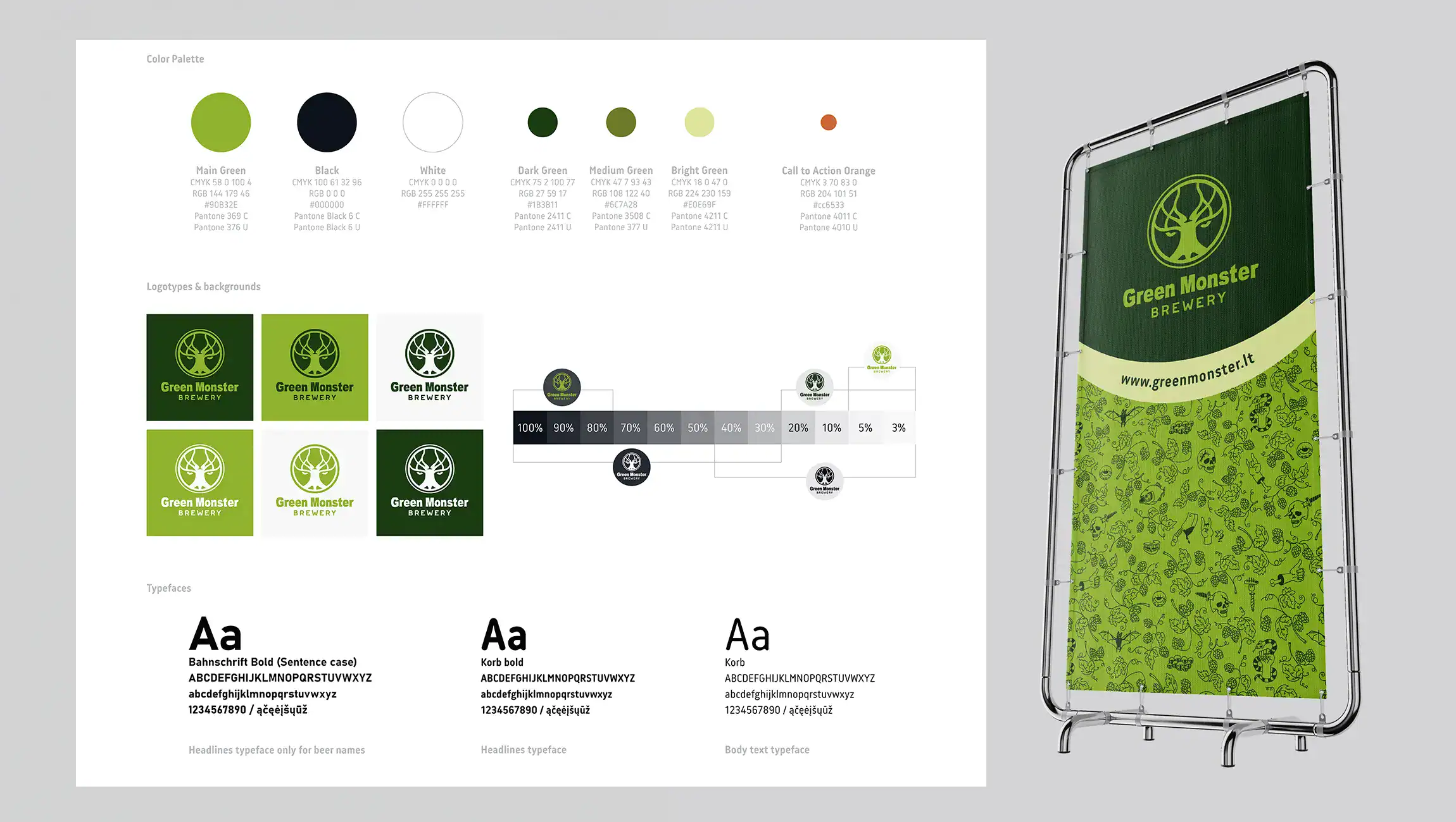
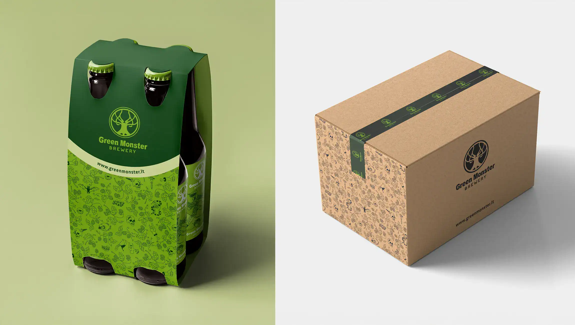
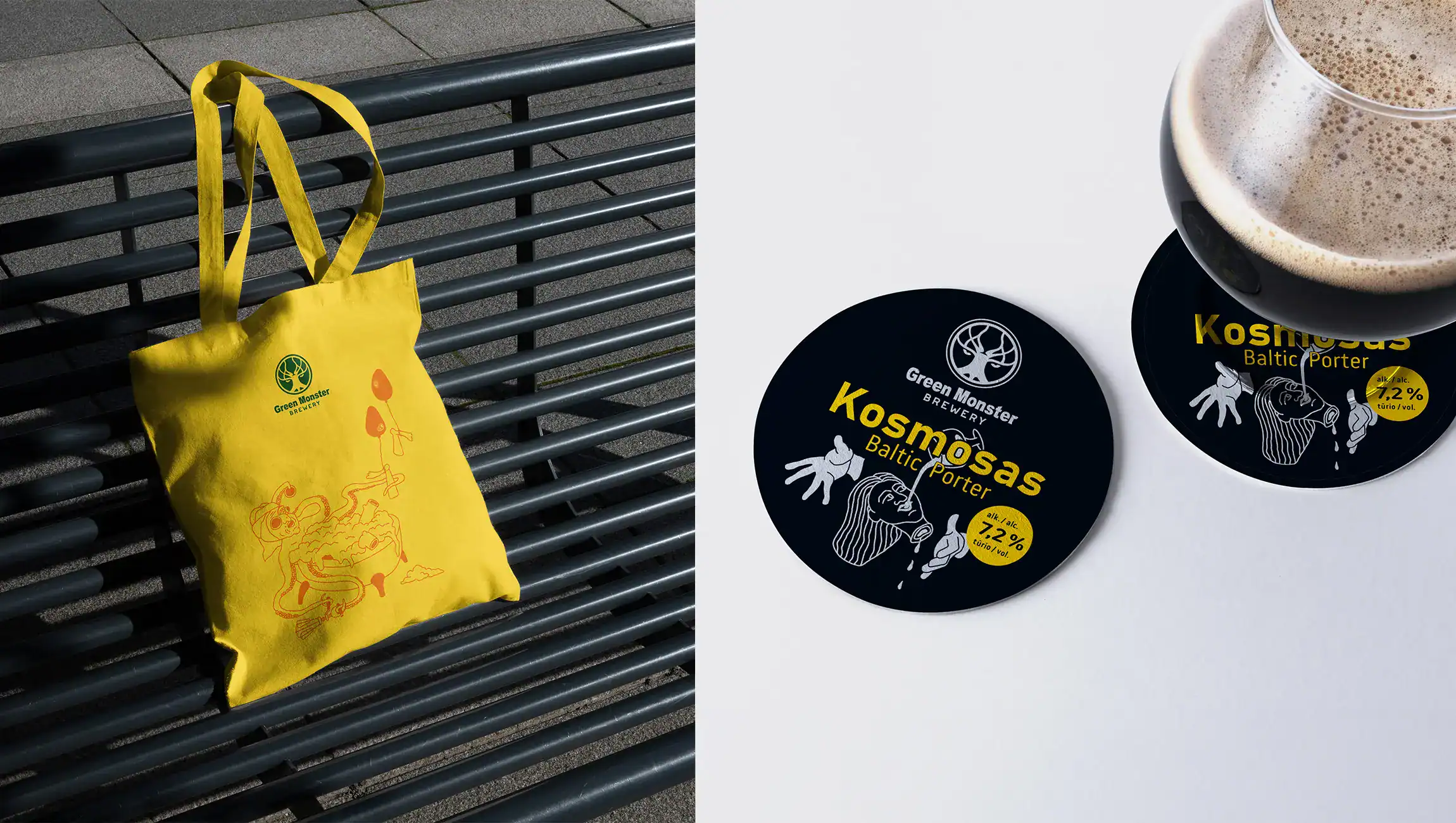
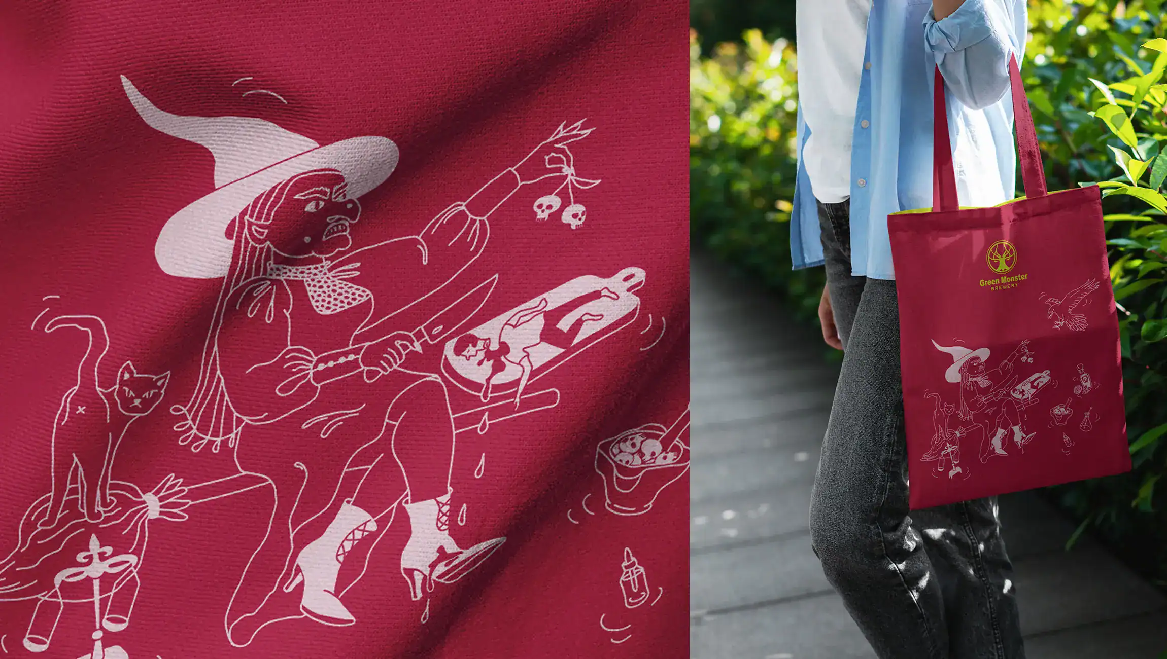
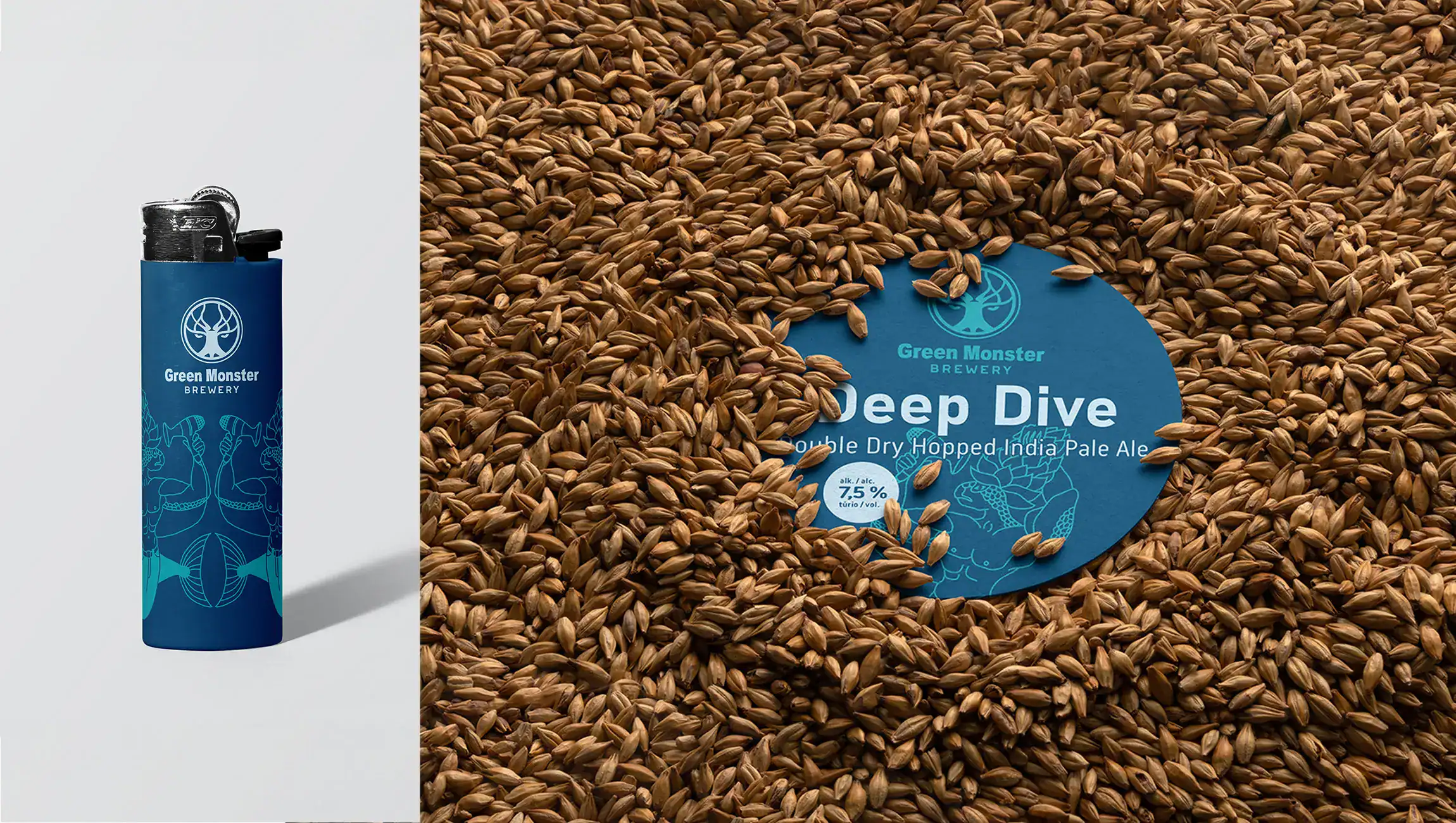
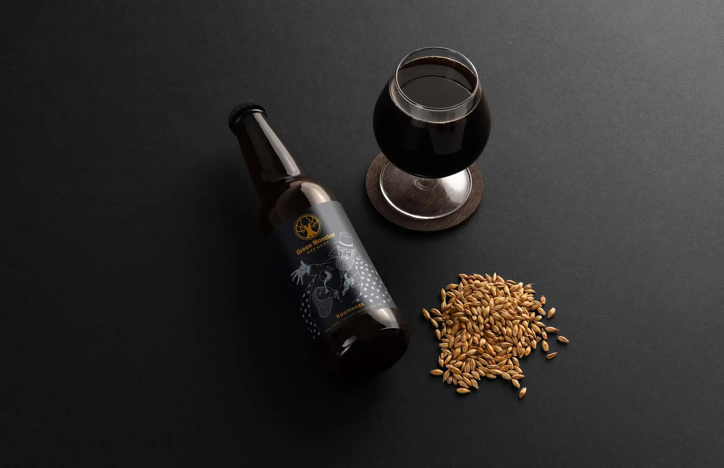
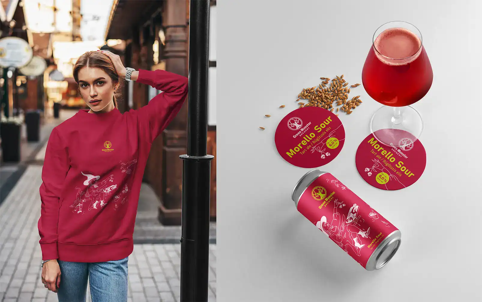
Green Monster brewery visual identity items
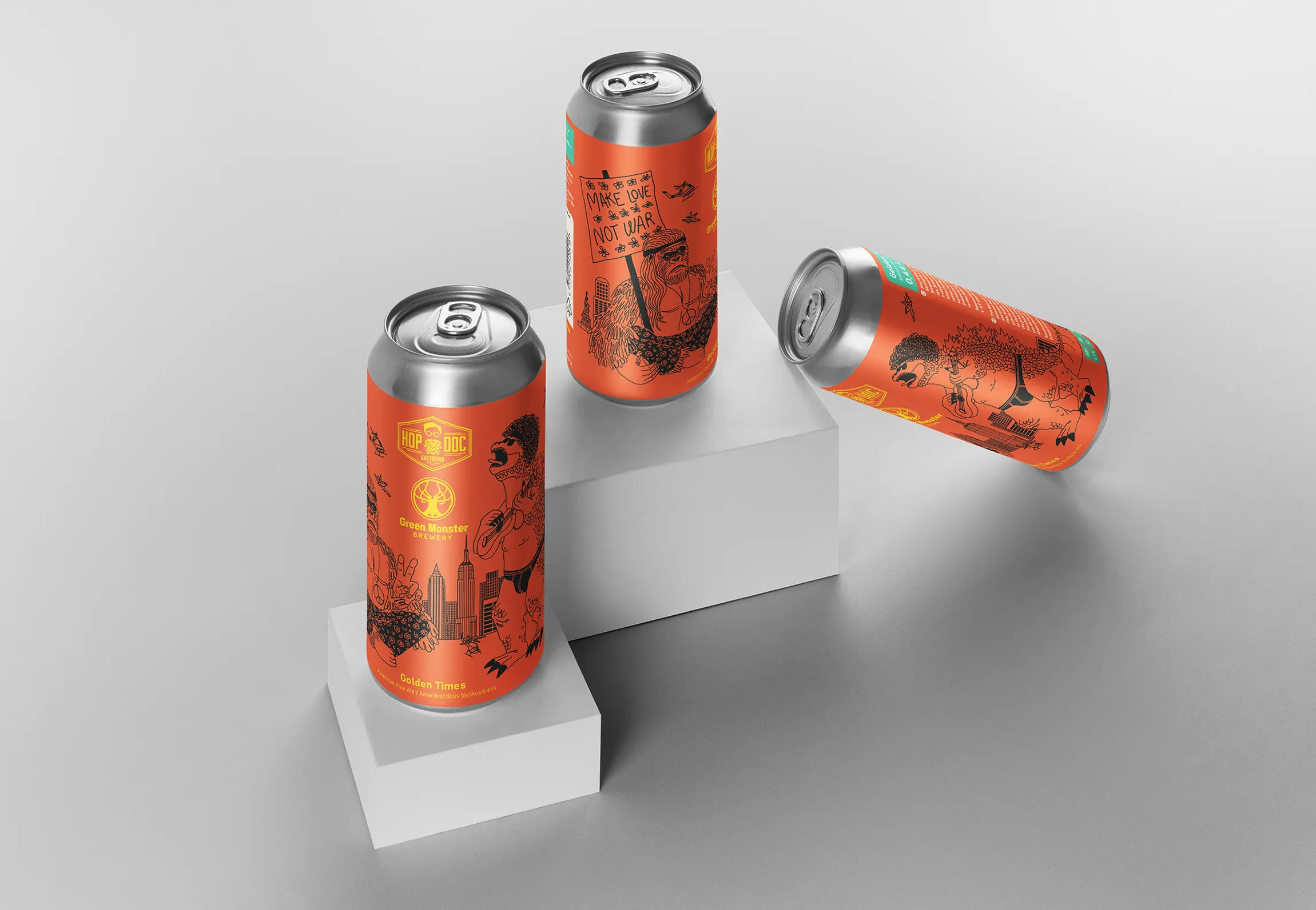
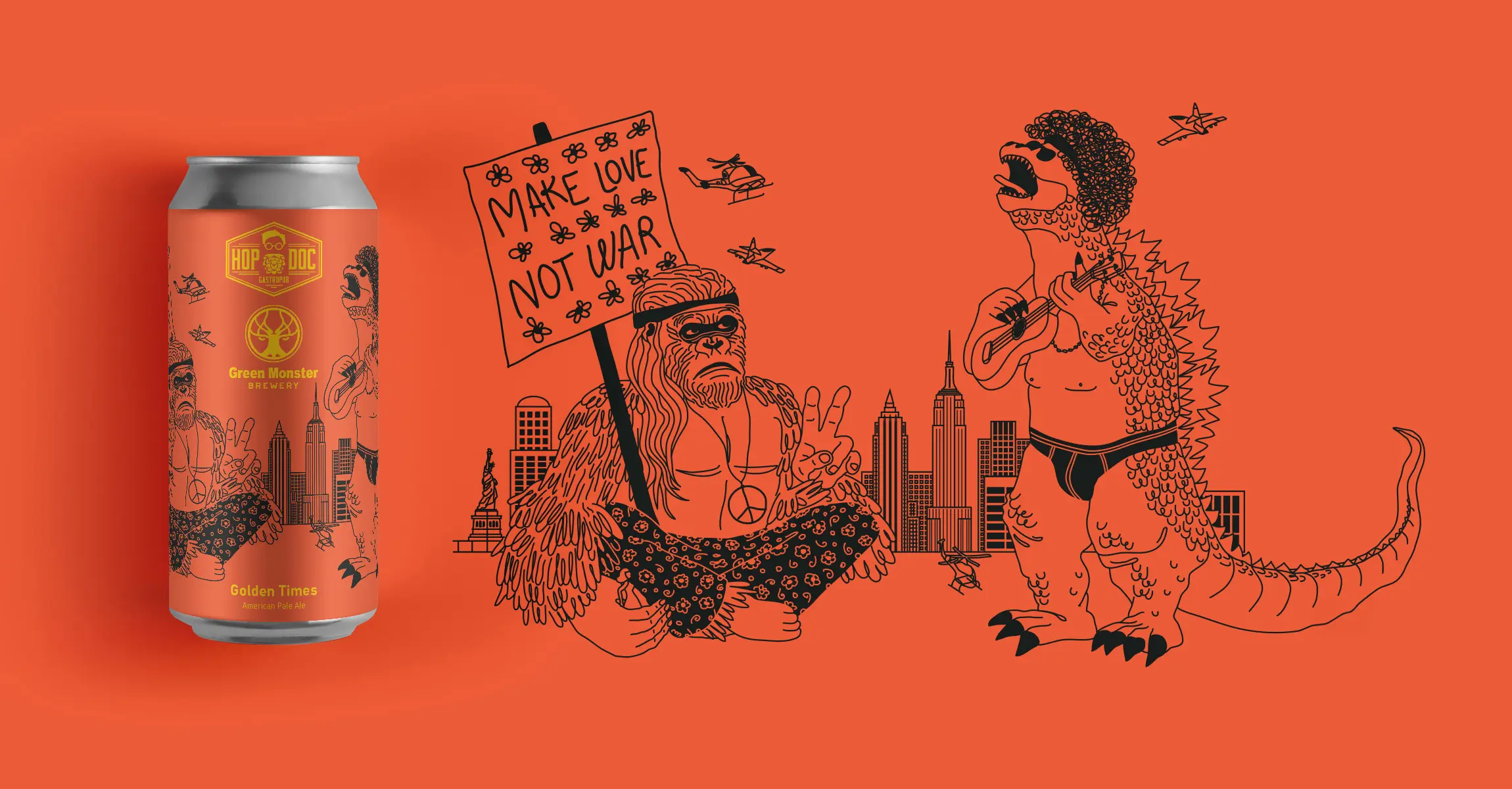
Breweries and bars frequently team up to produce limited-edition beers. Each collaboration has nuances, so I wanted to set as few strict guidelines as possible.
The collaboration label may include more than three colours, but they should be just different shades of the same three colours. So the background should maintain a consistent and cohesive appearance.
Logos can be placed in various corners of the label but should remain the main focus and be prominently displayed.
Additionally, the artwork can be more extensive, incorporating additional layers of story and action to enhance the overall design.
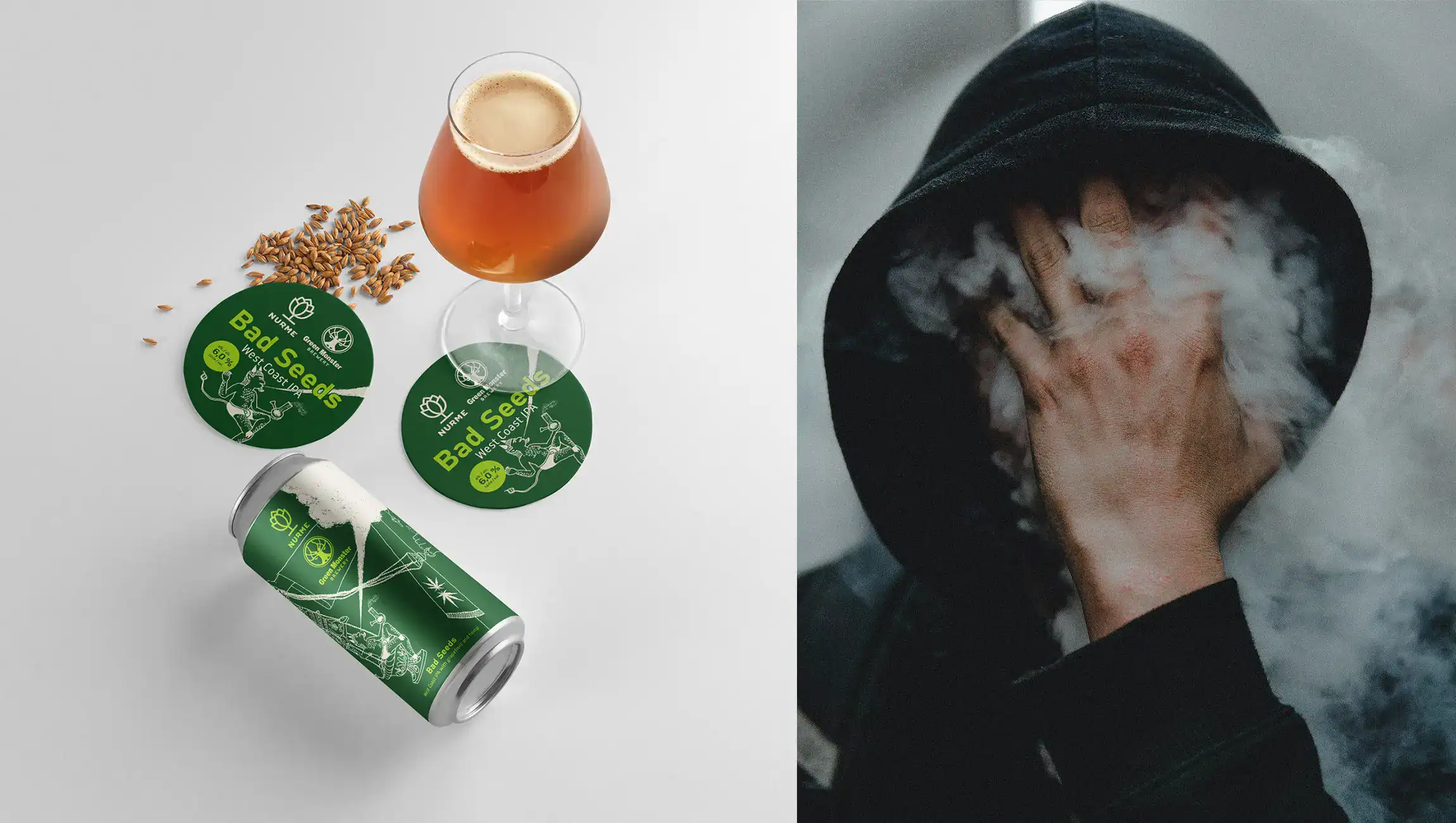
Collaboration label concepts have more details, more colours and longer stories behind them.
2
They also discovered, that convincing collaboration partners to use Green Monster Brewery's style on co-designed beer labels became easier. This way, they could boost the brewery's visibility.
Designs for collaboration brews with other breweries/bars
3
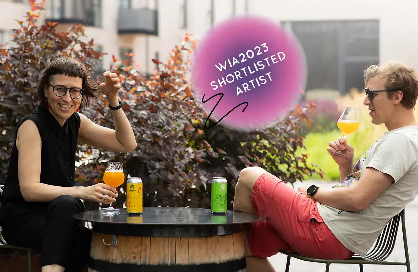
After spending the year creating monsters for new labels, I entered them into the World Illustration Awards contest and got shortlisted in the design, product & packaging category for new talent!
It is a significant accomplishment because they picked only 200 projects out of over 5,000 entries from 84 countries. You can check out my shortlisted entry here.
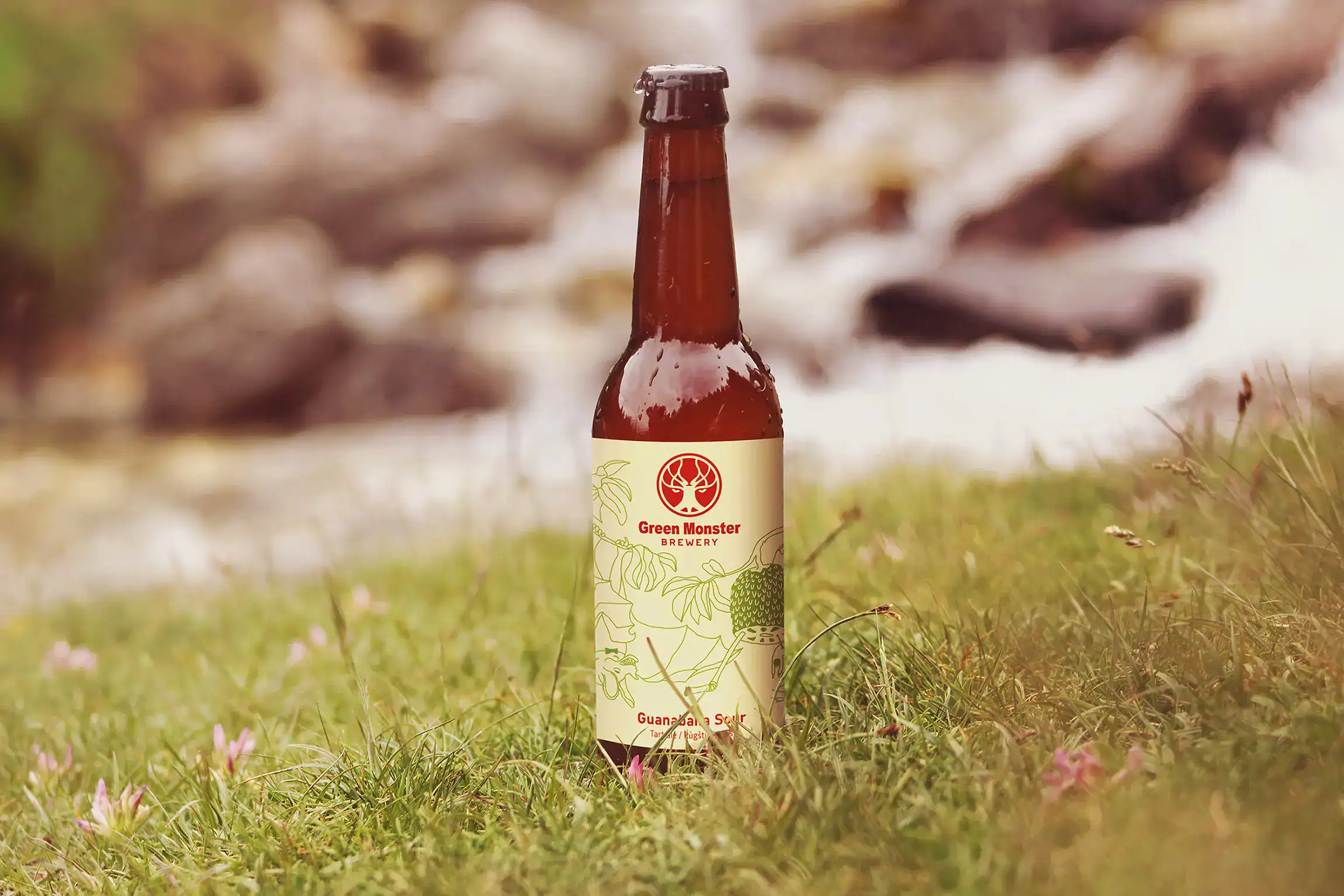
More about each beer and the story behind

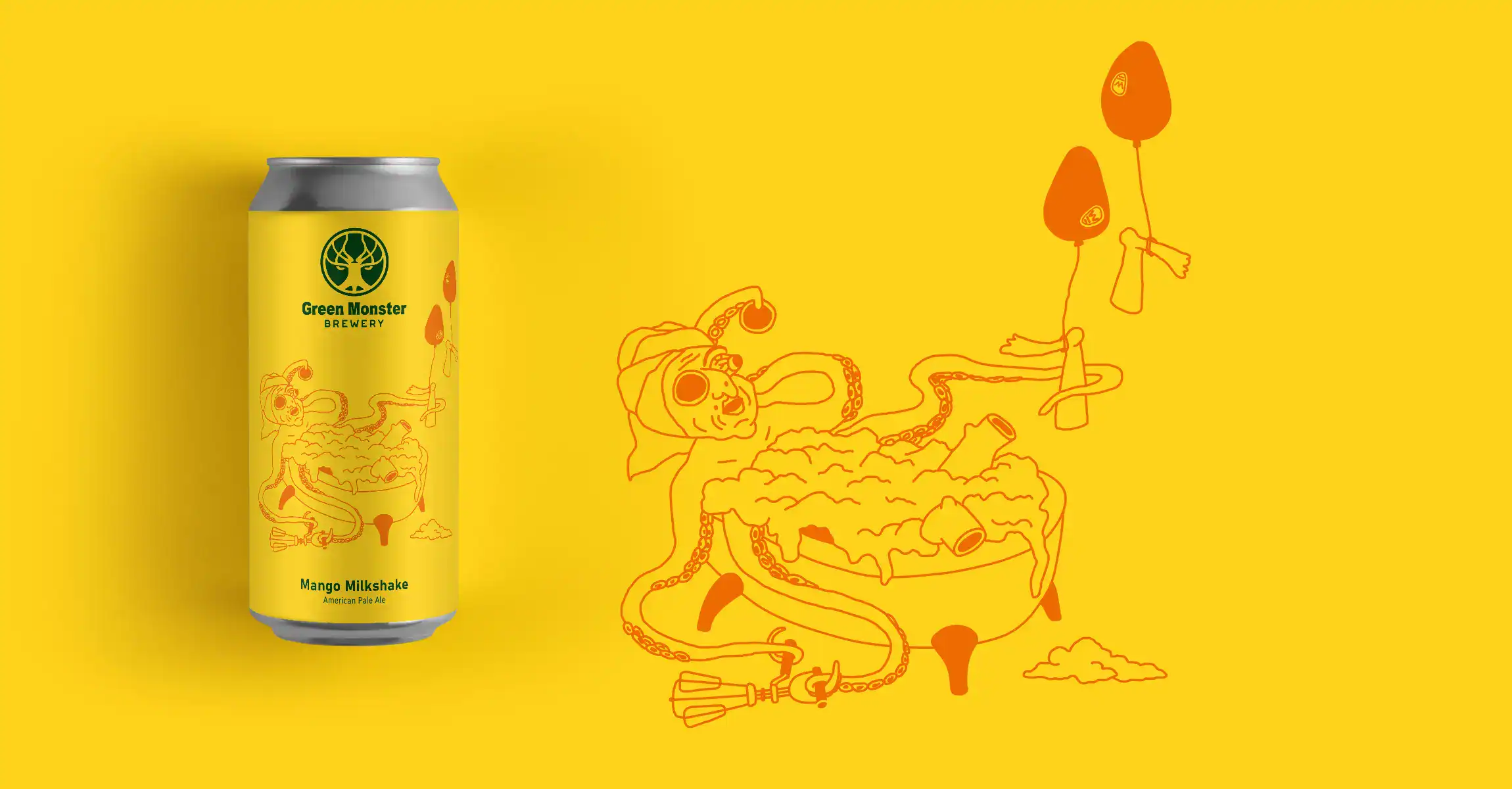
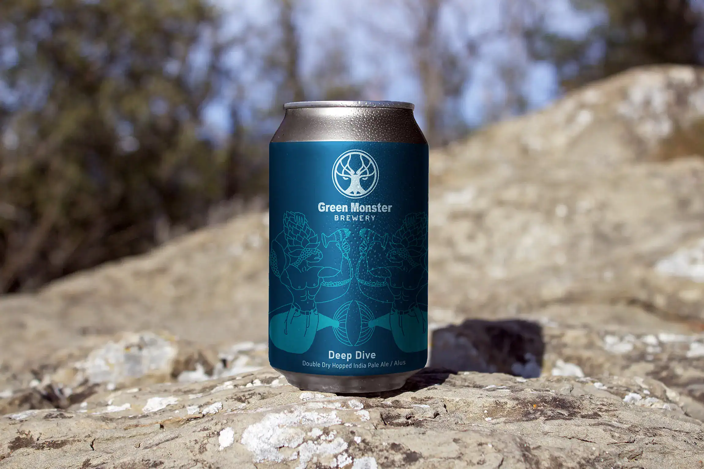
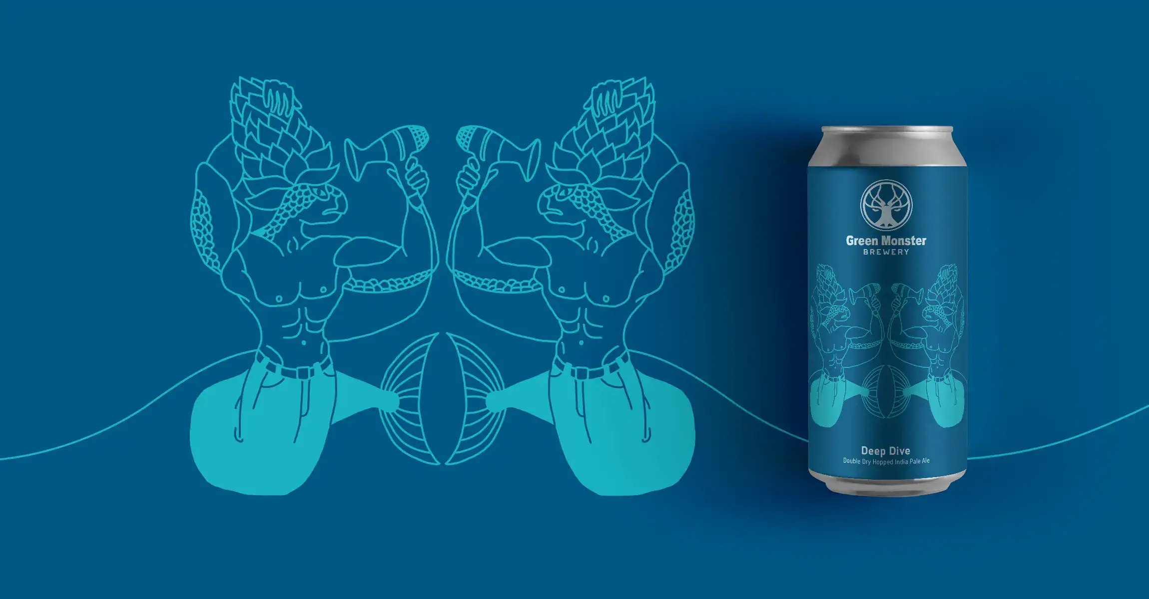

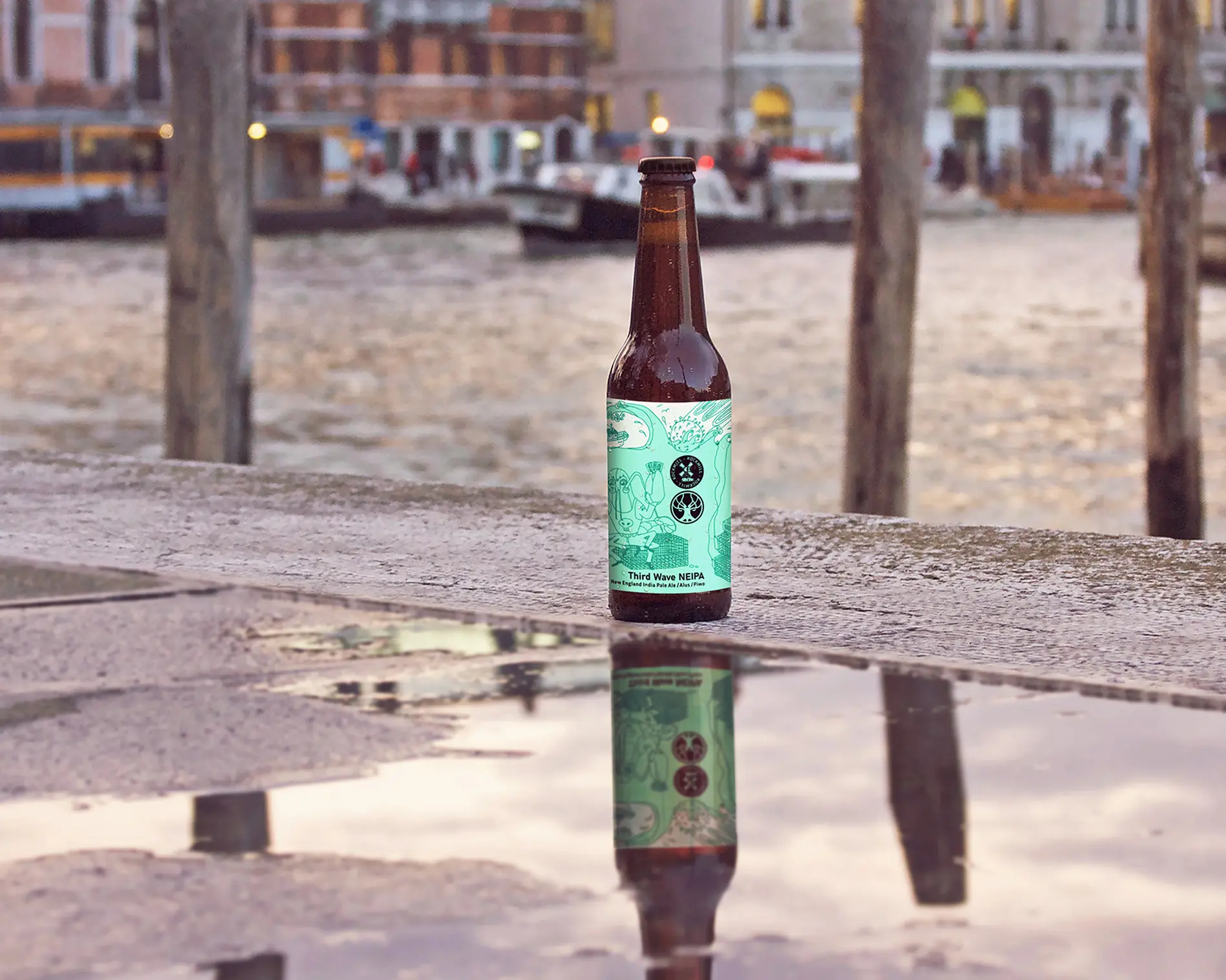
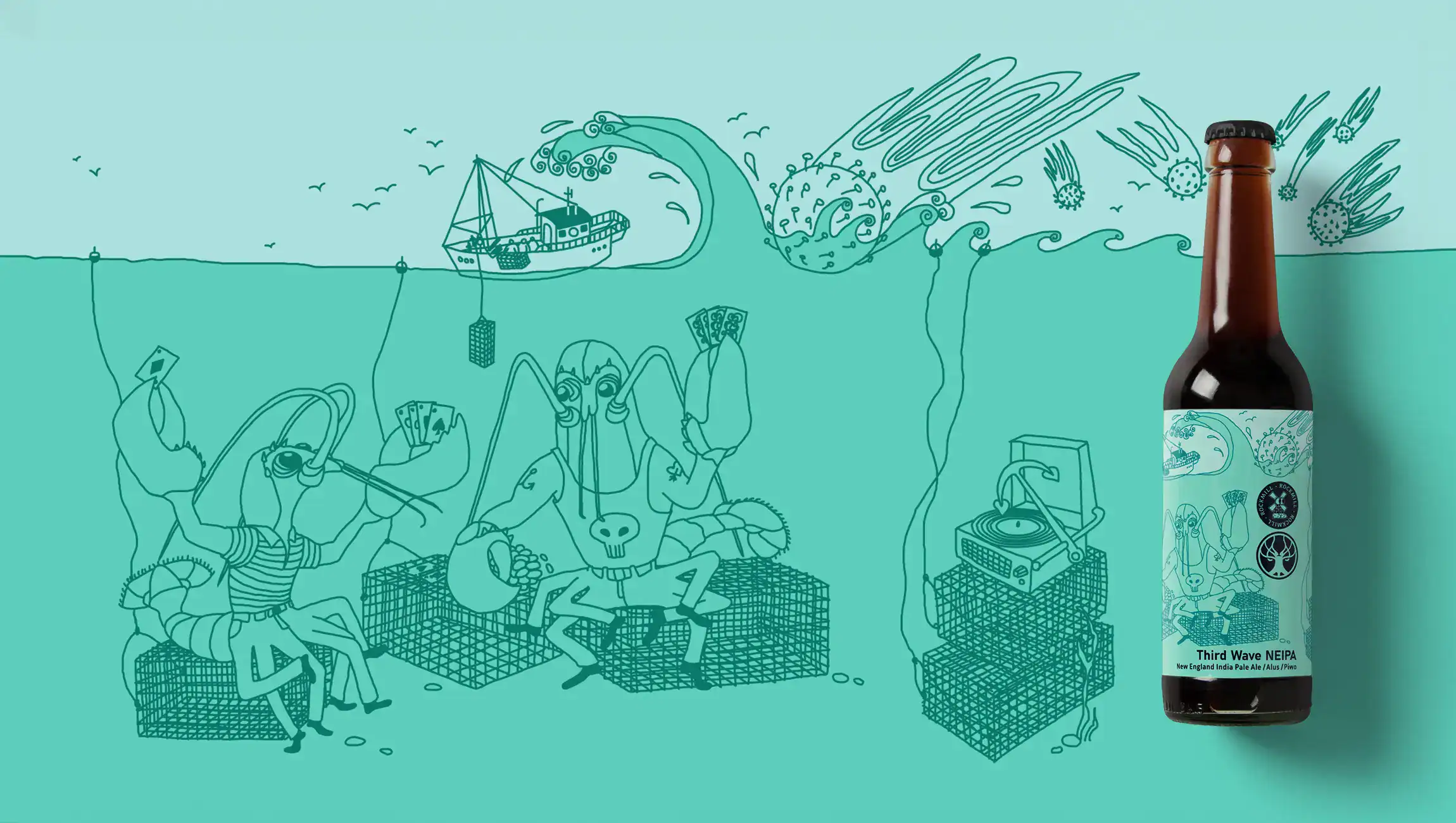
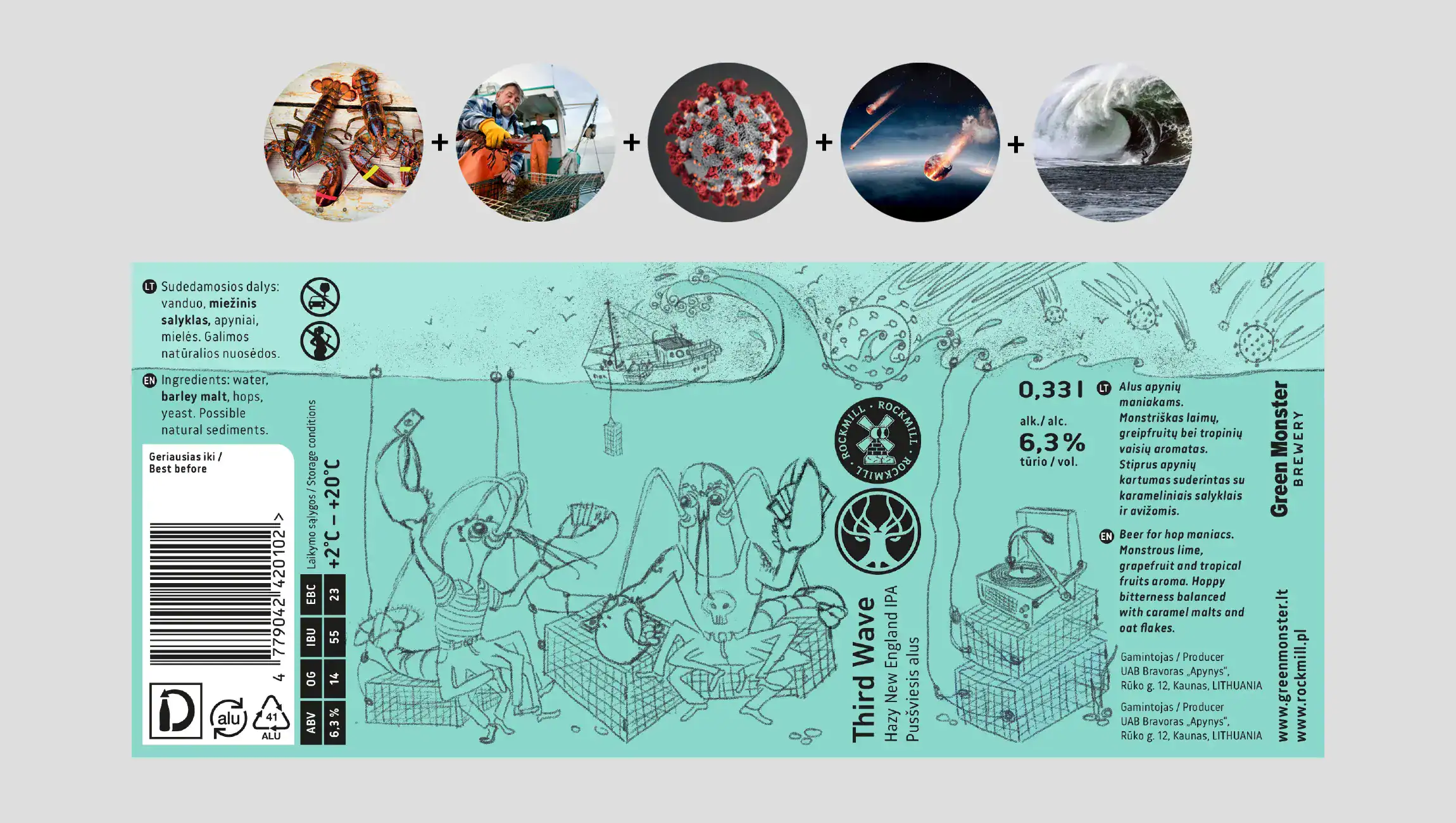
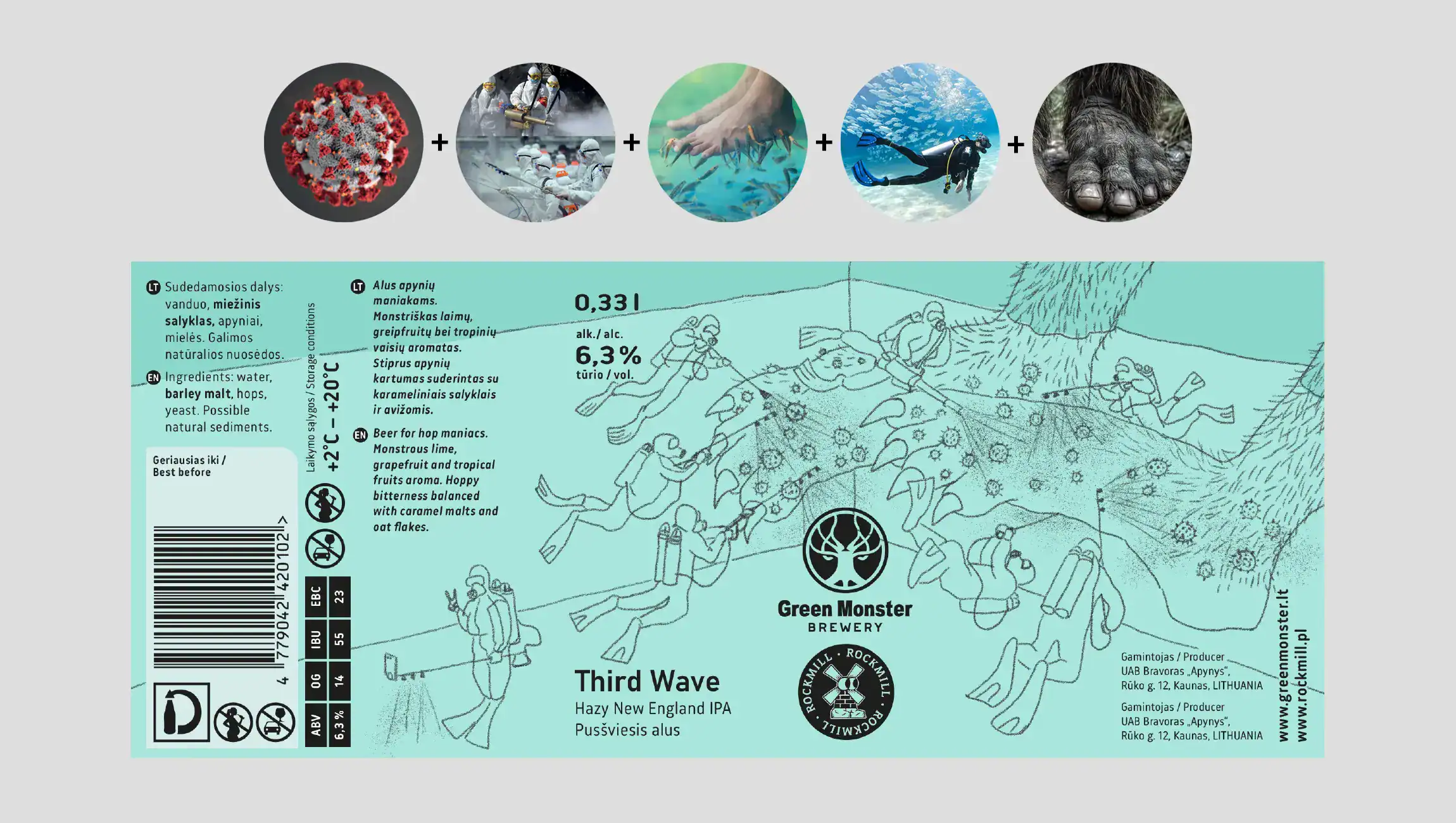
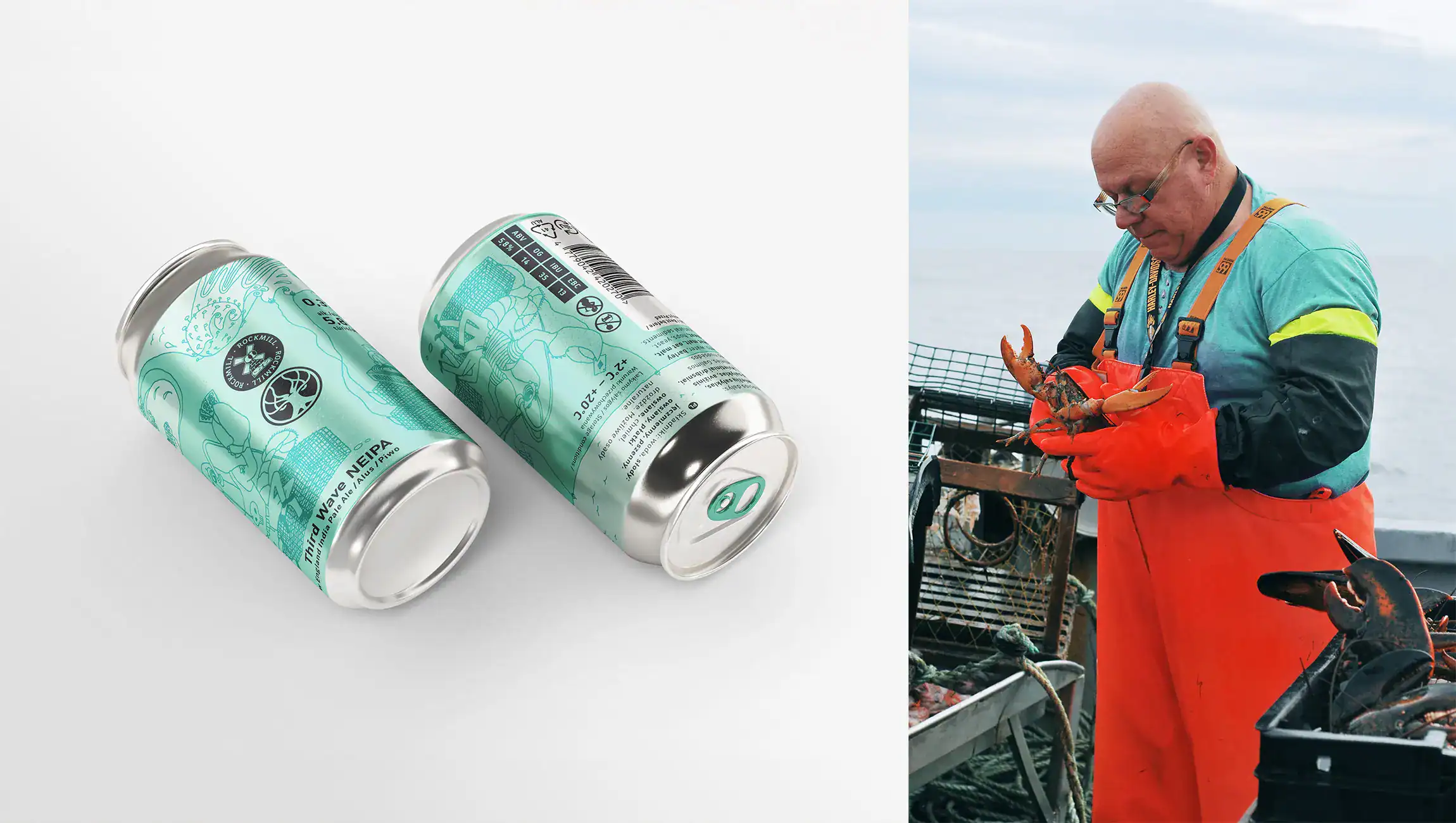
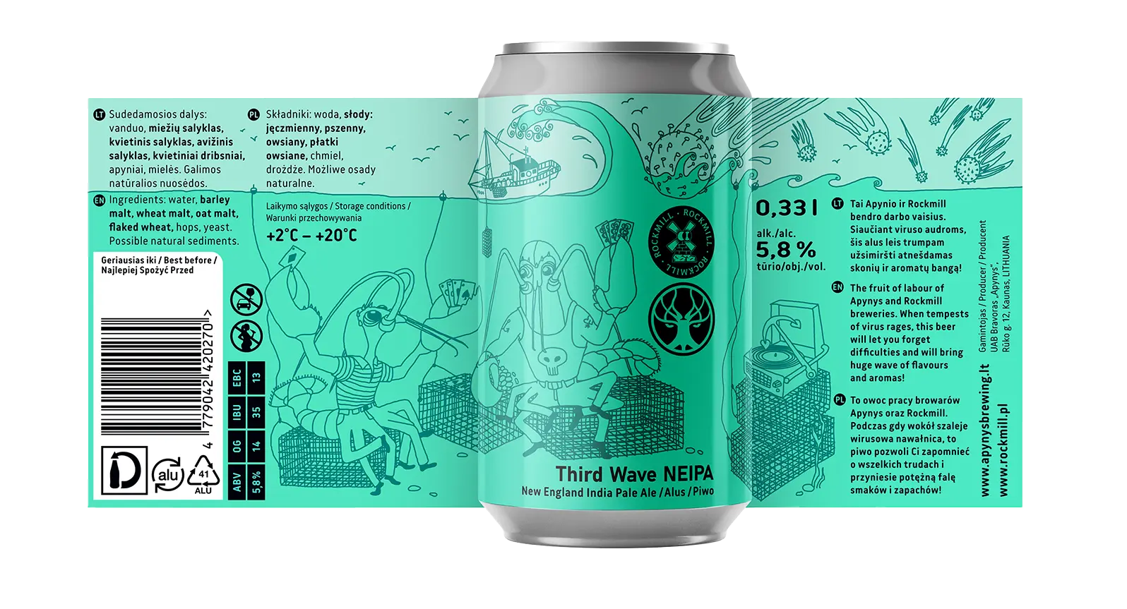
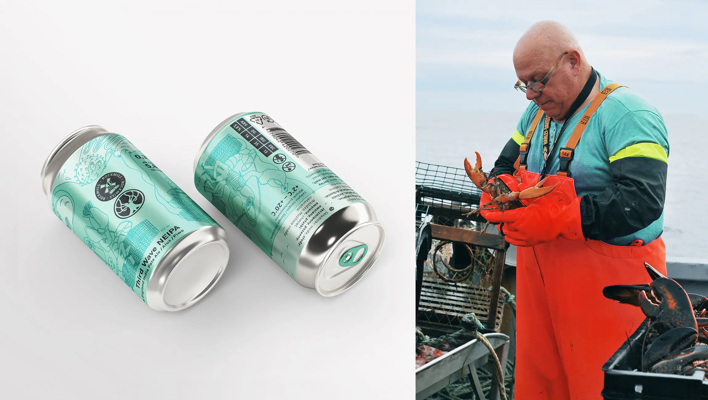
"When the storms of the virus rage, this NEIPA will let you forget difficulties and bring a huge wave of flavours and aromas!" the brewers promise, making the third wave of COVID-19 a focal point.
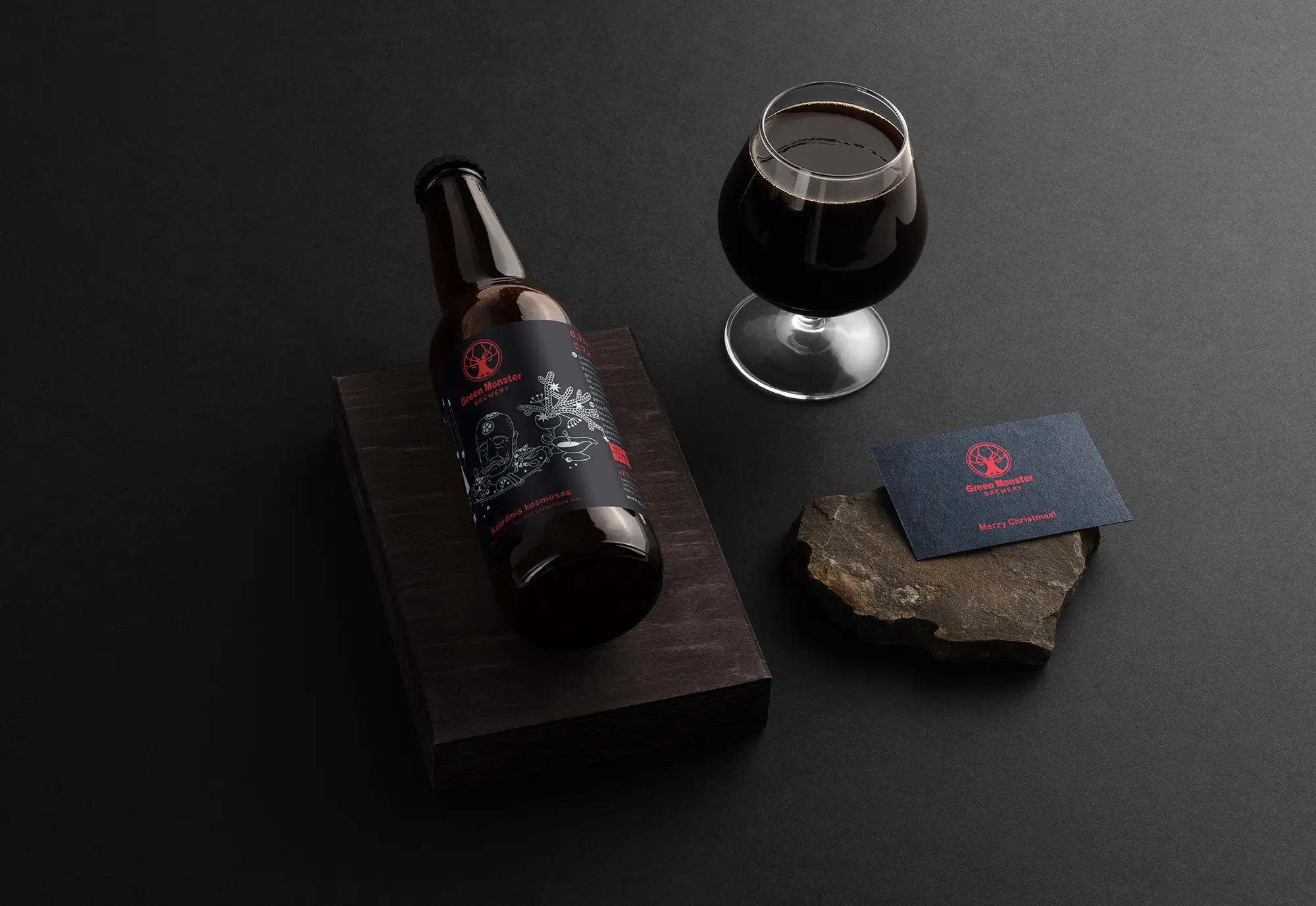
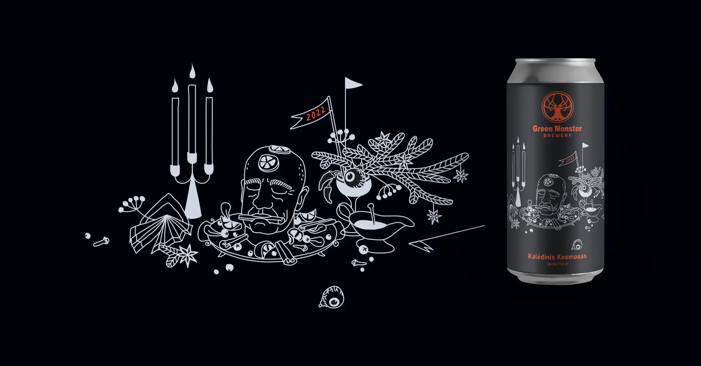
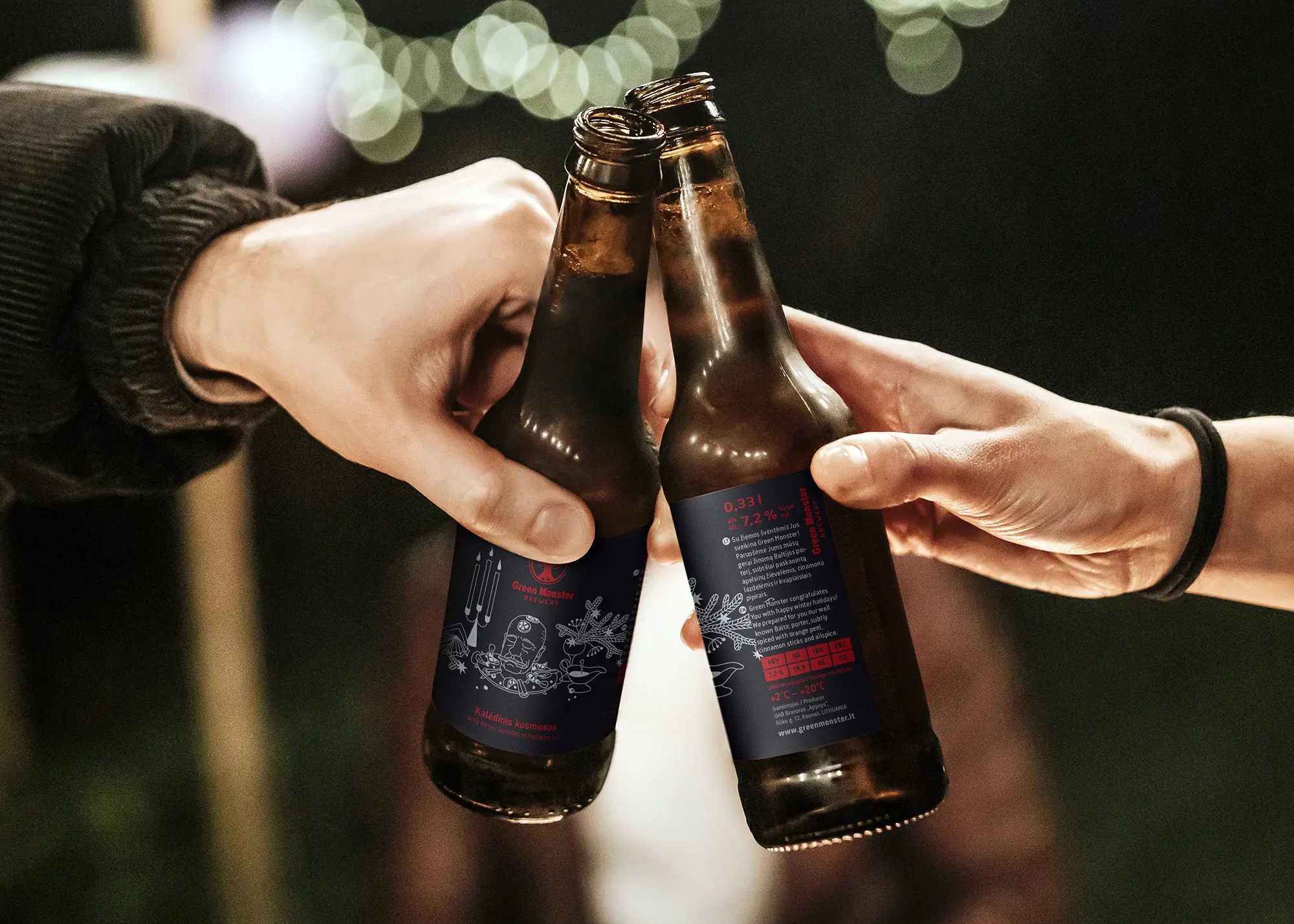
Infused with subtle notes of orange peels, cinnamon sticks, and allspice, it transforms into a Christmas roast pig, or rather, a monster's main Christmas dish :)
Credits for some photos used: Gabrielė Grėbliūnė (www.orangestudio.lt), Osvaldo Escobar, Jaroslav Devia, kroshka__nastya and others. Thanks a lot! :)

